Archive for 2008
Always: Leila
Wednesday, December 3rd, 2008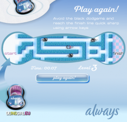 If the idea of playing a game on an Always sanitary towel disgusts you, just imagine how I felt developing this one!
Dispite the dubious concept, this little maze game is reasonably fun. Use cursor keys to race across the maze as fast as you can, avoiding the enemy cars.
Star Wars: Clones V Droids
Wednesday, November 26th, 2008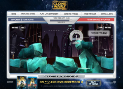 You have just 30 seconds to anticipate your opponent’s thoughts, give your troops orders and move them into position in this multiplayer ballistic fighting game. Then everyone opens fire, and another turn starts.
UPDATE! On playing this recently it seems to have been updated by someone, and broken in the process. The game now crashes often when you’re walking around, which never used to happen. What a shame.
Postmortem:
I could hardly believe it! Not only were we doing a game for the giant Star Wars Clone Wars franchise, but we’d pursuaded them to try something risky and unusual too! A custom-made ultra-light PHP back end would join random players together in an almost anonymous way over the internet so that they could battle each other rather than some shonky AI.
Not only that, but it worked too! In a little over a week, I’d built the game engine and back end and proven the concept. Then the public was unleashed on it. The server coped admirably with the strain of thousands of people playing it over and over. Success!
It could have been better, of course. Just about all things can be improved. In this game, I’d have liked to have spent a little longer getting a few of the interface details working smoother. It’s fiddly to set up shots, which is an area that could do with as little interface-friction as possible. That aside though, I’d really like to have improved the multiplayer features.
I designed the game to put a game together for every two visitors to the site. You get paired off with the next random that comes along, and you’re playing. Minimum fuss, minimum barrier to entry. My experience with lots of multiplayer games is that you get to a daunting room full of 11yo kids who are just waiting for a newbie to kick about the place. I specifically designed against that effect here by removing the ability to pick your opponent, or play them again, or even to know who they are. All you get is a rank – a single number to hint at whether they’ve played before, and whether they were any good or not.
This really works – people dive in and play in generally fair games, which is great. It also means we never have to store user accounts on the server, which is also great. Each player keeps their rank in their shared-object, and it is exchanged at the start of the game. At the end of the game, each player calculates their new rank based on the Elo chess ranking system, and stores it away for next time. Yeah, you could fiddle the number and cheat, but really, who cares? There’s no leaderboard, and no way to shout out how great you are, so there’s very little incentive to cheat. That’s the best cheat-protection system I’ve ever come across!
The downside is that whilst it’s addictive for a while, it won’t hold people for a great length of time. After a while you get bored of there being no further progression. Of not being able to chat with your opponent and of not being able to have a rematch if it was a great game. These features I’d add in another similar game.
I’d give the players a chat box, that they could use at any point especially including whilst waiting for the server to sync up and exchange the moves. I’d also add a ‘play this person again’ checkbox that appears mid-game, so if you both clicked it and left it selected, it’d arrange your next match against each other. I’d also consider an optional match-up room of some sort, so you could meet up with friends. I’d definitely let you enter a name for yourself and exchange that with the other player, so you had some idea who you were playing. Maybe allow a pictorial avatar too. And some sort of earned rankings beyond a simple number. Maybe a veteran’s medal after 10 games, a high-roller medal after they hit a rank of 1600 and so on. You could even allow different things in-game based on what they had earned. Maybe veterans get the ability to pick their fights more carefully. Perhaps high ranked people get access to new weapons when playing against other high ranked people. Giving the player some sort of progression, something to work towards, would go a long way.
Lessons:
- Multiplayer immediately adds depth to almost any game
- People love playing against people, even if they’re unidentified randoms
- Provide a way for people to communicate in-game
- Provide a way for people to arrange battles with people they know, if they want
- Provide a way for people to give themselves an identity of sorts in your game
- Provide some sort of progression for the player to work towards, over multiple games
- Removing incentives to cheat is far more effective than building technological safeguards against cheating
Hanna in a Choppa
Wednesday, November 5th, 2008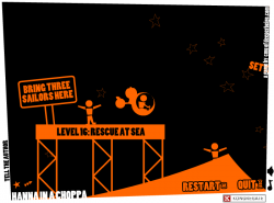 Can you help Hanna pilot her chopper through 21 unique and puzzling levels? Use keyboard or mouse controls and fly your way to success.
Postmortem:
For this game, I didn’t have any external clients. I didn’t have any final goal for it. I didn’t really have much of an initial goal for it. It evolved from almost nothing into something pretty special, almost by itself.
Hanna in a Choppa started life as Hanna on a Hoppa, which was going to be a physics game based on the latest version of my now fairly advanced AS2 physics engine. I’d just given it nice stable flat surfaces to bounce masses off, and they worked an absolute treat. I thought it would be hilariously funny if you played a sort of springy ragdoll called Hanna sat atop a space hopper, bouncing around off all sorts of surfaces and generally causing mayhem. I built the prototype in a short space of time, and discovered that it sucked. Bad. It turns out that space hoppers and physics games go together considerably less well than you might imagine. After fiddling with it for a while, I shelved the idea.
Later, whilst mulling over the name, I thought it’d be amusing to extend the punnage of the Hoppa into all sorts of other things. Hanna in a Choppa seemed like a good one, and I almost immediately had an idea of how to code up the helicopter in the physics engine. I threw a prototype together, and lo and behold it worked a treat.
Initially, the helicopter controls were inspired by an old Amiga game, Zeewolf. That had such an amazing feel to it, I wanted to do something similar, but in 2D. My controls worked and were mightily tactile, but suffered from the mouse wandering off-screen a bit. This is a virtually unsolvable issue in Flash, as you can’t constrain the mouse, but I could at least detect it and auto-pause the game, so it didn’t cause you to crash.
So on I went. I picked a simple in-your-face 2-tone graphical style mainly because I’m not great at drawing, but partly because it would perform superbly. And partly because it would hide overlapping object errors in the physics! From the cartoonish over the top style came the cartoonish over the top captions and level designs. The project grew and grew until about half the levels were done, and it had enough interface screens to show around to some friends for a bit of playtesting.
Disaster.
Nobody could get the hang of the controls. The beautiful tactile controls that I adored so much, and that I could fly with such finesse. All I wanted was to give that experience of harmony to the world, but nobody got it. Nobody understood. Everyone who tried, ended up stuck upside down in any nook or cranny.
I tweaked those controls. I added sensitivity settings, subtle self-righting, clever damping, non-linear response curves, all sorts. They all damaged the experience for me, and none helped for other people. I caved in and added key controls that drove the same force vectors that the mouse was attached to.
This was better. People could at least fly for a while now. For a while. Without any finesse, and bumping off walls a lot. On the plus side, now people were playing for long enough to appreciate the level design a little more. The fact that you could pick items up with a winch, push them around etc. The way each level presented a different challenge and task, not just a harder set of obsticles to fly through.
But it still wasn’t good enough. People got frustrated and still gave up quickly.
I caved a second time and added the key controls that you can play in-game today. You push right. The chopper flies right. You push up. It goes up. And so on. Finally it was accessable and everyone could play it. I didn’t like the idea of losing the mouse controls though, so kept them in and put the easier keys on an option.
An option that nobody played long enough to find.
So I added a new screen at the start of the game. New players were asked to make one choice – easy key controls, or hard mouse controls. A lot of people selected easy at this point and went on to have a lovely time. A significant number picked hard however, and within 30 seconds of gameplay hated the game. The curious thing here is that they never went into options at this point and changed back to easy. They just quit and went elsewhere.
So eventually, after a little bit of alone-time sobbing, I made the key controls the default. Most players would never go into the options menu and would never even try the trickier mouse option. It was the right choice. For certain. I haven’t read a single comment on the web from someone saying they enjoyed the mouse controls. A few people have commented on how tough it is on the mouse though, but they’ve already played the game enough on keys to not hate it.
Anyway, the game was now more or less complete. A few more levels remained to be built, and a couple of interface screens needed a bit of polish. Next came the love.
I’d been deliberately building love into Hanna in a Choppa as I went along. Little humorous comments and references in the levels seemed to go a long way with the playtesters, so I made sure they were all as amusing as possible. I ensured there was plenty of diversity in the levels, rather than increasing difficulty. That worked a treat too. People would keep playing to see what madness they had to perform next, rather than to improve at the game.
Adding the love was all about increasing the number of those little features that make people smile. So, for the hardcore gamers I added achievements. They announce themselves visibly when you get them, and you’re more or less bound to get a few by accident along the way as some of them are pretty easy (on purpose). Then, when you’ve completed all the levels and are hungry for more, you remember the achievements and hunt around for the screen that shows you what else is available to collect. I made some of them dead easy. Some flippant and silly, and some rock solid hard (like perfecting all levels – flying without touching the walls at all). This meant that people could play to whatever level they fancied. The elite gamers could get everything. Mid-range players could get a fair chunk but miss a few, and amateurs could drop out after beating all the levels. It’s a sort of self-adjusting difficulty curve in a way.
Then there was things like the developer message screen. I find feedback and stats unbelievably useful to get to know how a typical gamer thinks and reacts to things. If I ask for feedback, I know I’ll get a lot of rubbish, but there will be a few gems in there that’ll really teach me something. In Hanna, I made it an achievement to send me a message. Well, gosh, I got a lot of messages! And still get a lot of messages. That’s fine though, and there have indeed been some gems.
The “never press” button was well received too. I thought when I made it that about half the players would like it, thinking it cute, and the other half would think it entirely pointless and rant about it. Not so. Everyone who commented loved it, or apologised for making it cry. It seems people really do like sillyness for sillyness’s sake.
The rich feedback let me summarise the main criticisms against the game. I’ll respond here…
- It’s a bit slow on my old PC: Yep, fair comment. The physics engine is fairly heavy, and does a lot of mathematics. AS2 isn’t great at this (AS3 is considerably better of course, but I don’t work with it yet). A fairly modern machine should make a sensible framerate, but if it chugs on yours, sorry.
- There’s no quality settings: I know. That’s because a low quality mode wouldn’t help performance. In most Flash games, rendering all the pretty effects slows down your computer. Hanna has very few pretty effects, but does do lots of codey maths. The Flash quality settings just change things antialiasing, which for Hanna it can do in its sleep.
- The wench is a bit fidgety: Here’s a dictionary. Work out what you just said to me, then I’ll talk to you.
- Oh. The winch is a bit fidgety: Ah I see what you mean now. Yes, it is. Sorry. I should have done something about it really, but the physics engine isn’t really up to doing short bits of rope. It’s a totally fair comment.
- Level 8 is hard to perfect: It is on the crappy key controls, yes. If you learn the mouse like a responsible gamer should, you just flip upside down and throttle towards the fan in complete control. I suppose you’re right though, given all the stuff I wrote about above.
- Level 19 is hard to perfect: Yep, my fault again. On the mouse it’s a bit easier, but I know you don’t want to hear that. I should have made the survival space a bit bigger really, but that would have added three more physics surfaces to a level that’s already doing rather too much for ideal performance. Compromises were made.
- Level 20 is impossible: Really? Are you sure? Because I can do it pretty easily. You did remember your chopper has a wench winch installed, right? I mean, you have only been using it for 19 straight levels, so I see how it might slip your mind…
- All that orange hurts my eyes: Fair comment, hope I haven’t done you any permanant damage.
- There’s no end of game reward: Actually, there is, but only when you get all the achievements. To be fair you’re right though, I should have added something a little special for when you beat every level. My mistake. Again.
- Forcing me to write to you is lame: Hey, I wrote you a game for free that entertained you for about an hour! Can’t you write even a couple of kind words back? Bloody ingrates.
- Can you tell me how to make games? I’m just starting out but I’m 95% done making this amazing RPG but I can’t figure out gotoAndStop: Might I suggest the F1 key in Flash?
- this game suxxors u suck worst gaim evur 1/1000000000!!!!!!1: Learn to spell, learn to punctuate, learn some respect, create something worthwhile yourself, then we can talk. Thanks.
Lessons:
- Give creative things room to breathe
- Don’t get attached to any aspect of your game. If playtesters say a feature sucks, rip it out and put something better in. Just imagine multiplying ‘it sucks’ by all the people who will play your game. That’s a lot of suckage!
- Anything that turns a player off in the first 30 seconds will ruin your game’s play figures
- People don’t read instructions
- That one tiny piece of level design that isn’t quite right yet – FIX IT! Fix it or else. Fix it, or people will moan at you forever more about it
- Inject love into every corner of your creations. It pays back a thousandfold
- If you make it an achievement to send you a message, be prepared for hundreds of thousands of messages!
- Take the time to make the sound-stage work well
- A surprising number of people don’t know the syntactic difference between a winch, a wench and a wrench! My inbox is pretty comical at times
Selenia: UWE Science Comics
Wednesday, October 22nd, 2008 The Selenia site was created for University West of England to give teachers and pupils a fun science learning resource. There are lots of beautifully drawn comics available (created by a third party), along with supporting minigames and other stuff.
The site has a simple CMS so that the organisers at UWE can update the content, comics and games. It also has a facility that exports the entire site to static files and zips them up, so they can be used offline in a classroom from a USB flash drive or CD-ROM.
Hazard Perception Challenge
Wednesday, October 22nd, 2008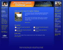 The Hazard Perception Challenge website provides learner drivers an online resource for practicing for their theory and hazard perception tests.
As far as I know, there’s no better way to practice for your hazard perception test online. No other service even comes close to the quality of interractive Wedding Videography we have on this website! If you’ve got your national theory test coming up, you need this site!
Not only can you practice your hazard perception skills in exactly the same way as the real test, but you can also test your theory knowledge with the official DSA question database. There are also car and motorbike driving videos narrated by a top qualified driving-instructor. This really is the best resource out there for learners.
Charlie and Lola – Hooley Hooping
Friday, October 10th, 2008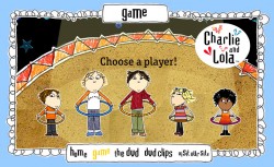 Pick your favourite character from Charlie and Lola and help them Hooley Hoop their way through this simple kids game. Tap left and right in time with the hoop to keep it spinning.
Apache
Friday, August 22nd, 2008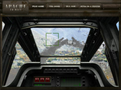 Use keys and mouse in this two-level Apache Gunship game. Do you have what it takes to take orders accurately and take on the role of gunner?
The first mission is a little slow going, but the second mission is worth getting to for the machine gun and rocket action.
Narrated in-game by the actual Apache Gunship pilot who wrote the book, this game is authentic in every detail possible. You can’t get closer to the experience of the real thing online!
Skulduggery Quest
Friday, August 22nd, 2008
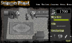 Register to play the quest, then use cursor keys to walk around and the mouse in mini-games.
Postmortem:
The game consists of four main chunks, tied together into a quest:
Hub: Walk around in a vaguely Zelda-like fashion, exploring and picking stuff up. This is intended as a sort of story-led role-playing-game section that takes you through the other mini games.
Spot the difference: Just the basic spot the difference game transferred to a computer. You get a different puzzle made up each time so it doesn’t become completely trivial to solve if you replay.
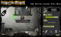 Magic Levitation: A physicsy lift ’em up. Not sure I’ve played anything quite like it before – you have a magical levitation ability that you have to train up until you can chuck the item you need out of the window.
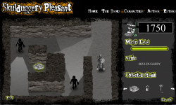 Cave Exploration: A bit like the old Amiga game Commandos. You have to find the final important game item whilst evading the sight of the guards.
Individually, each mini game is amusing for a bit. The big problem with the game as a whole however is the lack of cohesion. I think this stemmed from a lack of adequate planning in the early stages, leading to a fair bit of making-it-up-as-we-go as the deadline encroached. What we ended up with was a nice enough game engine for an RPG, but with no strong story or other characters to interact with. For a story driven game, having no story sounds like a bit of a deal breaker to me. And if there were a story, having no characters also sounds like a problem!
There’s some neat code running under some of this, despite the lackadaisical gameplay experience.
Hub: Whilst walking around, you can pass both in front and behind most objects. I came up with a method to do this that doesn’t require constantly swapping the depths of everything. There are two copies of the clip that contains all the scenery objects positioned directly at the same spot on screen, with your character sandwiched between them. Each item’s position on screen is compared to the characters. If it is above the character then the back version is set to visible and the front invisible. If below, the other way round. Flash’s _visible property works internally by simply skipping the object when rendering to screen, so its very efficient this way.
I wouldn’t recommend you build a similar system however! There’s a downside (isn’t there always). Whilst it works really fast and reliably with one moving object, if you add any more you can’t guarantee that its possible to sort things still!
Levitation: I’ve been developing a lightweight springs and masses engine for a while now. It was last in use on the Rant game, and before that to do a string effect on Paul Steel’s site. Each iteration the springs get more stable, the masses collide more realistically and the efficiency of the engine improves.
The physics engine grew a couple of features for this game. Attractor and repulsor masses for a start (to do the actual levitation bit). The game worked beautifully with an attractor mass – it was like trying to pick things up with a weak magnetic ball. It wasn’t all that easy to play however so I made it a repulsor following the mouse position instead, and got a lovely floaty feel.
The collision engine got an overhaul too. It now has a concept of collision sets. This is a way of tagging a mass such that it knows not to check for certain types of collision that can’t happen, or even that we don’t want to compute to help the game effects. There’s another major performance enhancement gained from sorting all the masses along the x-axis. The sort routine is built into Flash’s runtime engine and hence almost free in terms of execution time. Most of the Flash built in stuff runs really well, but as soon as you try and do something complex and algorithmic in ActionScript (version 2 and below that is) the inherent sloth of the language’s dynamic style means everything grinds to a halt. Anyhow, after the x-axis sorting, masses are only compared until one is found on an x-position that cannot collide no matter what. This runs in both directions from the mass in question and the search is culled beyond the discovered limits. This gives an impressive performance boost overall, at the expense of a small amount of fidgetyness of masses as they settle (if they sort into a different order after a small movement, they get itterated in a different order for collision responses, which can give a different outcome response).
I’ve made pretty heavy use of Flash 8’s new-ish bitmap processing for graphical effects. Push the light around with your magic, and watch the shadows. Its a subtle effect but the shadows move around depending where the light is coming from. Shadows get longer, fainter and adjust their position all in realtime. This is all done using the new drop-shadow filter on each of the graphical objects in the scene, and a bit of trivial trigonometry. A simple effect, but powerful, and I haven’t seen anyone else doing it yet.
The graphical effect of the magic itself is scripted too, rather than an animation. Particles of magic are placed onto a bitmap each frame, then the bitmap is faded and colour transformed via yet more filter effects. Over multiple frames, moving things leave trails across the screen. Pretty.
Caves: The base engine for the caves section is identical to the hub. I can hear what you’re thinking (if you’re still awake). You’re asking how it can have NPCs wondering around when the system can only cope with depth sorting against one moving object. You weren’t asking that? Well you’re getting the answer anyway.
The NPCs follow a set path. They are at a set depth with respect to the walls etc, and are duplicated in the same way (in fact, they’re just objects in the world like any other). If you pick their path and depth in the scene carefully, you can engineer it so that they don’t look wrong. It just means you can’t have an NPC wander about freely as they can’t walk both behind and in front of an object without causing odd glitches. On the final screen the baddies do laps of an island-wall, which seems to break the engine’s rules again. The trick is that the baddies don’t actually go behind the wall at the top – they just stay above it a little. Look carefully and you might see their shadows glint above the wall rather than behind it.
Visual line of sight ‘vision cones’ were a challenge too. It isn’t all that hard check if a particular point on screen is in sight of another particular point. You just cast a ray between them and see if you hit anything that blocks sight along the way. Or if you have the walls in vector form you can check for collisions mathematically with a line intersection check.
To show a cone of vision however, you have to run the above check for every pixel that might be in sight. That’s generally a hulluvalotta pixels, and infeasible for realtime Flash games.
I’m fairly proud of the technique I invented to get sufficient performance here. I first cast a shadow off the back of each of the wall segments to the edge of the screen. This is done by simply projecting the end points of each segment out plenty of distance and joining the dots. This polygon is then drawn to a memory bitmap with the drawing API and clipped to the visible area. Flash is superb at doing this sort of manipulation as long as the shapes are simple, so there’s only a minimal performance cost here.
Once the shadow of every wall is drawn (as if the enemy in question is a light source), we have a set of pixels that the baddie cannot see. A little bitmap magic to invert this, and we have a mask we can apply to its vision cone drawn complete. Job done – our baddie can’t see through walls anymore.
One nice bonus with this technique is that we get almost free line of sight tests between the baddie and any point on screen. First do a hitTest against the complete vision cone shape. If the test succeeds, do a pixel colour lookup on the mask bitmap at the appropriate point. If that point is within a shadow, we’re out of sight. If not, we’re visible. HitTest and getPixel32 are both lightening fast.
This technique has a few unavoidable downsides. Firstly it uses two large bitmaps for every baddie. This means lots of memory allocation (bad for old machines) and lots of pixel setting (bad for any machine in Flash). Its setting all these pixels every frame that costs most of the time in this routine, even though those pixels aren’t used directly on screen. There is also some kind of bug in the Flash player that leads to rapid memory leakage. Switch screens and you lose a meg or two of memory as the new baddies are generated. You also lose a smaller amount each frame. I eventually traced the leakage to a line that reads;
clip.cacheAsBitmap = true;
Without the line, no memory goes missing. With the line, megs per screen. Doesn’t seem to matter if you turn the caching off later, you still lose the memory. This is something that the Flash player is meant to entirely manage internally, rather than it being the programmer’s responsibility. The same behavior exists on the Mac player too, curiously.
Final lesson learned: On the PC Flash player, Key.isDown(1) is a fine way to read if the left mouse is pressed. Its a fine way to find out nothing at all on the Mac. That’s the first really significant difference I’ve found cross-platform with Flash. A testament to just how well the player is built and tested!
Nuts TV: Supreme Fighter
Friday, July 18th, 2008 Combine the best stats of all the fighters on Nuts TV into one super-character, then use him to beat all comers in this Top-Trumps style game.
 RSS 2.0 full site