Archive for 2006

Iron Maiden: Different World

Thursday, December 14th, 2006
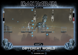
iron-maiden-different-worldUse cursor keys and mouse to fill the screen with bullets in this platform-shoot-em-up. Collect as many of the blue power-ups as you can to upgrade your puny starting gun into a harm-producing device of chaos. Double jump if you need to, and press down to reload in quiet moments.

Postmortem:

After the success of the first Iron Maiden game we built, EMI comissioned a second. This is the result – a fast paced platform shoot-em-up. I had a specific goal in mind from the start, and that was to make it as over-the-top as possible. I wanted to be able to upgrade the gun tens of levels so that it goes from a weedy pop-gun to a bullet spitting death dealing mayhem device. I achieved that, but somehow a screenful of bullets still wasn’t quite as satisfying as I’d wanted. The solution was a mega-powerup that gives you all the max gun settings, at double the firing rate and with a rose-tinted death-glow over everything. That works quite well!

I think one reason the gun isn’t quite as satisfying as I’d wanted is simply that it doesn’t make much noise. We tried out various sound effects, and none really fitted. Plus, they dominated the sound-stage completely since you’re pretty much firing the entire time you’re playing.

The platforming element works remarkably well for the simplicity behind the scenes. Everything is based on a simple hit-shape that defines where the ground is, and care is taken that you can’t fall so fast as to tunnel through it. The sliding trapdoors are then just animations in that hit shape. So simple! The character can climb gentle slopes and stairs, which is essential if the player isn’t to get stuck on the slightest of objects.

The automatic, fixed pace level scrolling works well to keep the pressure on. It wouldn’t suit all games of course, but it serves its purpose well here. The only downside is that the character animation moonwalks a lot of the time!

Baddie AI is ultra simple too. They are generated at fixed positions in the game, and follow a set path. They shoot at random, but directly towards the player. This is enough in this game’s case to produce plenty of challenge, since there’s lots going on.

We struggled graphically for an explosion sequence. They always just looks pasted on top, rather than being part of the action. In the end, we settled on not having one and instead flashing the baddies brightly for a second and making them fall apart. The result works well!

Whilst this game was well received, it wasn’t anything like as widely played as the first Iron Maiden game we built. I never quite understood why, but very few portals seemed to pick up on it. I don’t think it was seeded any differently to the other game. It was still a success, but nothing like as strong as A Matter of Life and Death.

Lessons:

  • If your game contains a dominant power-up, make sure it is given at designed points in the game rather than at random
  • Everyone loves to fill a screen with bullets
  • Don’t force your character to stop shooting back whilst he’s taking damage!
  • Spend the time to make the character climb up slopes and stairs automatically. It’s well worth it for playability
  • Double jumps add to the fun factor and controlability of a character
Happy Feet Mail

Tuesday, November 28th, 2006

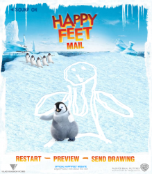
happy-feet-mailDraw out a picture then send it to your friend. They’ll see it drawn out for them by Mumble the penguin dancing across their screen!
 

Unaccompanied Minors

Friday, November 24th, 2006

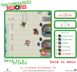
unaccompanied-minorsRace against the computer drivers in this all-action speed game! Use the cursor keys to steer your cart around the airport, avoiding crashing into things!
There are three tracks of varying difficulty to race on, and practice/race modes to try out.

Postmortem:

I’ve always loved cars, driving and everything associated, including racing games. I was thrilled to be building a driving game to promote a film, even if the film was one of those Christmas cash-in kids flicks that hardly anyone had heard of (I haven’t even seen it myself, several years later).

Having never built a driving game before, I had a lot of technical issues to solve in a relatively short project build time. Given that the cars in question were airport baggage handlers, I thought it perfectly acceptable to cheat and give them perfectly sticky tyres, which made dealing with things like realistic skids, oversteer, understeer, handbrake turns etc much easier: They simply didn’t exist in this game.

Surprisingly, this technique worked just fine and the game feels perfectly OK. There’s an issue with not being able to see far ahead on the track (partly solved by scrolling the player’s car to the opposite side of the screen to the direction of travel).

To give the illusion of sliding, I added faux skidmarks that fade in whenever the player has been accelerating and turning for more than a set amount of time, and also when they brake. This turns out to be easily sufficient for an arcade racer like this! It’s surprising what shortcuts you can get away with sometimes. Skidmarks are attached permanantly to the track, which is bad for performance but looks great after a few laps.

Graphically, it’s pretty easy to get lost on-track sometimes. You kind of have to learn which way to go on a slow lap, then put your foot down later. I suppose that’s what the practice mode is for, but I can’t help but think it would have put some players off to be constantly crashing into the walls.

On the subject of crashing, the collision detection and response was another technical issue. Car to car collisions were done by detecting when two cars were within a certain distance of each other and tweaking their position apart like billiard balls, then applying a small speed penalty. This works remarkably well, and gentle nudges don’t penalise you much so you can go for those risky overtake opportunities without fear of ending up miles behind. It helps the AI to stay on course too.

Collisions between the cars and the track edges however are not so good. I built several test concepts, none of which really worked before settling on one that was more or less adequate. It still isn’t good though, and really could have done with lots more work if the project were given extra time. The way it works is to test the corners of the player’s kart against a giant hit shape that covers the track. If a corner is in collision, a circle of samples is taken around that point. An approximate line is generated here, and the player’s car is pointed along the reflection vector of this line. The problem however is that the line approximation is a bit flaky, and varies considerably depending on exactly where the samples fall. This means you can be turned unfairly into the wall rather than away from it, or bounced inside the collision shape and all sorts of other horrible artefacts.

One aspect of this game I’m quite proud of is that the AI players are driving cars that are identical to yours. I.e. each AI player has a virtual left, right, up and down control that they can press. The rest of the sim of the car is identical to the human’s car. Except it isn’t collided with the scenery! The AI isn’t smart enough to get out of a bad collision with the edge of the track, and at the time most people’s computers weren’t really fast enough to run the collision detection for all 6 cars together either. The AI follows a virtual track path that differs for their ability. A good AI driver follows a neat track path. A bad AI driver follows a wonky path that misses apexes etc. The path doesn’t define exactly where to drive, but defines a line to be followed if possible. The computer measures its distance from the path and steers towards it appropriately, following an algorithm that real industrial robots use to navigate warehouses. This means it can deal with moderate perturbations from the given path if the player collides with it and pushes it off course.

The game was well received by people who played it, it seems. This may be to do with the fact that most Flash racing games are total junk! In fact, I don’t think I’ve played one yet that I really like a lot, including my own!

Lessons:

  • Racing games are popular!
  • Racing games are tricky to write and balance
  • AI drivers are hard to program!
  • If you spend the time to make a good driving game, spend a bit longer filling it with plenty of tracks too. Three isn’t enough.
  • If you add a bit of code that doesn’t work very well, don’t just accept it! Find a way to make it better or suffer the consequences

Ape Club Parachute Game

Monday, November 13th, 2006

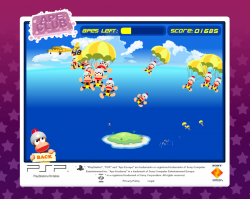
ape-club-parachuteClick the falling parachuter on the main screen to go into the parachute game. It’s a simple game of clicking on falling monkeys. The trick? The monkeys fall more and more rapidly leaving you floundering to keep up. Can you find the 1000 point bonus technique for the ultimate scores?
 

Robo Range game

Friday, October 27th, 2006

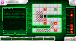
roborangeSolve the puzzles by dropping command tiles for the robot to follow in this unique puzzle game. Compete worldwide for the fastest times over each set of levels and see your name on the highscore table!
Click “Robo Game” at the bottom to get into the game. If you want to play the advanced levels, the access code is 3003.

Postmortem:

I was allowed a lot of freedom in creating this game, and came up with the concept from scratch. The idea of using a primative form of programming to promote a toy that would appeal to technically minded kids worked well. There’s a little added depth in the game in the fact that you can work towards a most efficient solution, as well as just completing each puzzle.

Whilst it looks like a pure logic game, astute players will spot that the timer starts as soon as you drop your first command. This means actually there’s a certain amount of skill required to get fast times, as your first tile-drop should be on the robot itself to get it walking as soon as possible. This also means there’s a best-possible solution for each level. I really like these subtlties and they interplay with each other to create a deeper and more unique experience.

The initial levels are designed to teach the user how to drive the robot around, but are not meant to be entirely trivial still. Each concept is introduced separately which is a good thing, and a puzzle that isn’t necessarily instantly obvious is given at the same time. The idea was to avoid the boredom of learning that often comes with games like this before the real challenges.

The graphics for this game were done by a collegue, and are generally excellent. There are a couple of exceptions however: holes don’t look quite enough like holes, and crates don’t quite look moveable enough. The crates issue is partly down to the fact that you have to be able to see what’s under them at various points in the game, but the holes could have been better. Specifically, they should afford the possibility of dropping not just the main character but also crates into them, since disposing of crates is essential for some of the puzzles.

Two big mistakes damaged this game’s success severely. The first is that we were told to lock the third (and best) set of puzzles behind a secret code. The code was distributed on notes on the shelves in Toys-R-Us stores. It turns out nobody (and I really mean nobody) finds these and takes them home to try out. I calculated from the stats that the locked content was played by just 7 real players in the life of the campaign! It’s a real shame, as people who played the initial levels and were hungry for more could see that more existed, but couldn’t get at it to play, so would have been frustrated.

The second big mistake was that the game was never seeded widely. Therefore very few people got to actually play the game because nobody knew it existed! For one of my favorite personal game builds, it’s quite a sad tale really. The site was visited by around 3000 visitors in the life of the campaign, which is pathetic by any standards! I plan to make a spin-off game using the same concept one day, and to promote it using the modern Flash distribution websites.

I also made a smaller design mistake in the final locked level. You have to find a way to re-use one of the tiles. Turns out a minor gameplay bug introduced by the graphic designer means you can pick up a tile whilst it’s dissappearing, just after it has been executed by the robot. You can then re-use it elsewhere! Dispite hinting at that in the level’s text, it was still unfair to expect the player to find that. As a result, very few of the very few people that found the final level code, have completed the final level!

Lessons:

  • If you have highscores in your game, make sure that it’s always going to be possible to improve by a tiny bit. In this game, there’s a perfect performance for each level that’s pretty easy to do once you know how. The first set of highscore entries are all identical, which isn’t great for promoting competition.
  • Don’t hide away content behind difficult to achieve codes unless you want it to go unplayed by most.
  • Agressively pimp your games to as many places as possible to seed them for traffic. A game that nobody plays is just a waste of development time!
  • Don’t build dirty-tricks into level design. They can exist as a cunning way for the astute player to improve their score, but should never be required to complete a level.

Crazy Frog Banner Game

Tuesday, October 10th, 2006

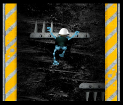
crazyfrogI know I know. You hate the Crazy Frog. Yep, so do I, but work is work. Besides, I did my level best to inject as little evil as possible into this banner game! In fact, it actually ended up a fairly decent little game for what was just a day or so’s work.

First to address your fears:

  • There is NO Crazy Frog music in this game
  • There are NO popups in this game
  • There are NO horrid sound effects in this game

Right, with that out of the way, click the link and play the game! Click the mouse somewhere above the frog and he’ll leap upwards. Hit spikes or get crushed, and you’ll be killed (which isn’t the point of the game, but you might enjoy watching him die anyway). Climb as high as you can before you get squashed.

Postmortem:

It’s a simple game, but quite good fun in its own way. The level is pre-defined and whilst is a little unfair with hidden spikes that shoot out from a couple of places, is mostly a decent challenge. You can play in a very short space of time too, which means you don’t have to invest much effort to have another go.

We did a pretty good job of keeping evil out of this banner, which I personally think is essential for trustworthy advertising. If the banner annoys people, they’re hardly going to want to buy the product, right? The only minor bit of evil is at the top of the level, there’s a platform that’s just too far away to reach, so you always fail. This was done to save file-size in terms of having an end of level and a win sequence. It’s a banner after all.

I was pretty pleased with the motion of the frog itself. It seems that most people figure out how to get him to leap mostly where they want him to go within a few clicks, which is good. I’ve built other games along these lines where people just don’t get it no matter what. There’s a lesson here – a jump preview line would go a long way for user training, even if it’s only there for the first few jumps then vanishes.

Pieces of the People We Love

Tuesday, September 5th, 2006

piecesofthepeopleweloveTo promote The Rapture’s album ‘Pieces of the People We Love’, I created this microsite where fans could upload their image and a small profile to the band’s site. Their image became a part of a picture of the band. This really worked well with the album name, as people who uploaded a photo literally became pieces of the people loved by the band.

The site was a decent  success and thousands of fans engaged and uploaded a picture. As the picture filled up more and more, the site automatically rearranges the images on a slightly smaller scale, so it always looks like there’s only a few more images to go before the image is complete. Ok, so it’s a dirty trick, but it really encourages people to get involved!

Call of Juarez

Tuesday, September 5th, 2006

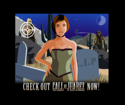
call-of-juarezUse your mouse to shoot the baddies and avoid the maidens in this minigame promoting the Call of Juarez computer game.
This whole project was built start to end in a day from supplied graphics. It is intended as a throwaway banner game (without any evil popups etc), but actually turned out fairly decent for such a short build.


Shark DJ Database

Tuesday, September 5th, 2006

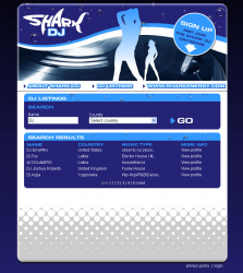
shark-djA simple database site for the Shark energy drink. You can register as a DJ and people needing DJ’s can find you!
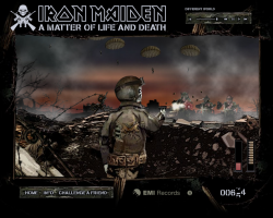
 

Iron Maiden: A Matter of Life and Death

Wednesday, August 30th, 2006

iron-maiden-a-matter-of-life-and-deathUse the cursor keys and your mouse in this all-action shoot ’em up. Kill anything that moves, including zombies, parachutists and more. Don’t forget to reload by ducking behind the defensive wall.

This was my first big game with Hyperlaunch, promoting Iron Maiden’s new album ‘A Matter of Life and Death’. A build time of a couple of weeks allowed us to push the boat out more than we had done before, and add effects and flair for the sake of polish, rather than just getting the minimum done. The result is a game that plays well, and looks and sounds great. It was played by over 3 million people worldwide, which was a huge success for the campaign.

Postmortem:

The game features destructable baddies that you can hit in all sorts of places for different effects and scores. For example, shooting a parachute a number of times makes it collapse, but you can get more points for hitting the tiny zombie figure on the chute itself. He can even be seen dropping his rifle and slumping on his ropes, and you can still take out the chute for even more points. This worked really well, and people who liked the game and wanted a deeper experience would learn how to maximise their points from each baddie.

There are 3D bullets too! I spent a fair bit of time getting them just right, including having them drop off in their trajectory in the far distance. The interraction between 3D bullets and the essentially 2D game engine worked surprisingly well too, with bullets being hit-tested as they passed through a particular Z-depth. I expected that to feel wrong and look unfair, but you just don’t notice what a faux-effect it is when playing! In fact, this is a game entirely made by it’s gutteral feel. Essentially all there is to do is click on targets that pop up, and reload occasionally. Having the atmosphere just right really makes it work.

The bullets even ricochet off objects. On the third level, this is really noticable with the tank turret. Bouncing bullets can still hit baddies, and it can be a surprisingly effective way to take things like parachutes out. Again, these tiny subtle features all add to the overall experience and help produce depth that otherwise wouldn’t exist.

On reflection now, the sound stage is a little overpowered by the music. I spent quite a bit of time getting things like the ratatatat of the machine gun just right, and it gets drowned out by the Iron Maiden song. Not that I don’t like the song of course, it’s excellent!

This game really reflects how essential a good graphic artist is to a project. The artist involved was superb, not just in his artistry but also in understanding the requirements I gave him in terms of how I was going to build the game. I’ve worked with lots of artists who can produce a pretty picture of a game, but only the top few can produce it in such a way that it’s then easy to convert it into working software. It’s not just about organising assets to be easy to work with (although that does help), it’s also about things like effeciency of design so that good-looking effects can be built up from a minimum of runtime elements, which helps keep performance brisk.

The only bit of artistry that didn’t quite work as we’d have liked was Eddie’s gun-arm. As it bends around the screen, it flips to some pretty unnatural and disturbing looking angles!

Lessons learned:

  • Add subtlty in gameplay wherever possible
  • Work with the best graphic artist available for maximum win!
  • A big name client helps considerably