ss Great Britain: Full Steam Ahead
Sunday, August 25th, 2013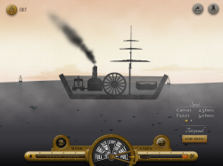 Design, build and sail epic steam ships in this educational game from the ss Great Britain Trust and Aardman. Cross seas, carry cargo, fight tug-o-wars, try for top speeds and more. Make sure your ship’s hull is strong enough to withstand the rage of the sea. If it isn’t up to scratch, it’ll break up and sink!
Play Full Steam Ahead in your web browser.
Download as an app for your Android tablet.
Technical Analysis
This is the first game I’ve released to work on several platforms: in a browser, iOS and Android. It turns out Flash is a superb platform for this, within certain constraints. The two big issues you have to deal with are screen shape/size, and mobile performance.
Screen shape/size
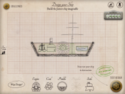 The array of screen resolutions and aspect ratios available now is bewildering. Just on iOS you have everything from a tiny low resolution iPhone 3, way up to a crazy high-res iPad4. Add in Android devices, and you have only two choices – design at a fixed aspect ratio and accept that most devices will have black bars at the edges, or you can make your design re-flow itself to different devices.
We chose the latter, and I’m glad we did. Black bars on devices look lazy. We created the design around the iPad2’s screen, but always with the possibility of it scaling to wider displays. We used a background texture that could scale up until it fit any screen. Then added elements like panels, flourishes and buttons that were driven in code to sit in calculated positions such as the corners, centre-top, absolute centre and so on. The centre content was scaled to fit as best as possible without breaking its aspect ratio, and everything else was scaled by the same amount then repositioned to its fixed positions.
My approach to this in build involves tagging movieclips with various properties to tell them where they should go and how they should scale. This is far easier than specifying the names of everything that should be positioned in code, and helps avoid you becoming lazy about specifying suitable auto positioning properties for things.
We couldn’t use huge high resolution retina textures for everything due to performance and filesize worries. Instead we mask some of the lower resolution textures with overlay noise, and keep detailed things like text and the fancy flourishes in vector so they render at the native resolution.
Performance
Mobile performance is lousy for native Flash display list elements. It’s better with bitmaps than with vectors, and you can take advantage of cacheAsBitmap to get the best of both worlds if you design with it in mind. Native display list elements are far easier to work with than frameworks like Starling however, so I decided to try to stick with them as much as possible. In this game, that means that all the UI screens are native display lists, and when you’re driving your ship around in real time, everything is rendered in Starling on the GPU. This hybrid approach works well, but you have to design the UI with minimal motion in mind. This game suits this approach well, but not all would.
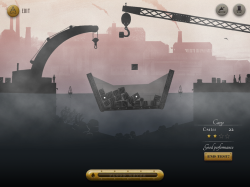 This was my first experience of Starling, which turns out to be a lovely framework. It’s small and simple enough to be understandable (even modifiable as I’ll discuss later), but powerful enough to be very useful. Mirroring the display list APIs means that seasoned Flash programmers feel at home with minimal learning effort too.
It’s well worth being aware of how Starling works for context switches and draw calls. If you can keep these low, performance may surprise you with how strong it is! It’s quite easy to accidentally add in context switches by interlacing sprites from different textures in the same display list container.
Performance on iOS initially looked awful all round. Then I realised that the default quick build mode gives you an interpreted binary, which executes very slowly indeed (maybe 10x slower for code execution). There are other options for creating properly native code, so make sure you understand what each option does before you write off iOS performance as hopeless. The native compile however added an extra 5 minutes to the overall build time on a quad-core i7 processor (which for the test version was just 10’s of seconds).
Because of the excessive build time for a high performance iOS build, I used Android tablets as my mobile development devices and only cross compiled to iOS occasionally to make sure things were still good there. I found AIR’s compatibility across Android and iOS to be exceptional, and the code contains almost no special conditions for iOS. The only major difference I found was in managing selections in textfields, which I couldn’t get to work with iOS’s built in software keyboard.
The other advantage of building for Android first is that installing on devices is far easier. It’s hard to imagine how Apple could have made their provisioning system any less helpful to developers, and the exact opposite can be said for Android. I set up my compile script to simply copy the Android APK file into my Dropbox folder on my desktop, then I could just install it via Dropbox on my devices with just a couple of taps. I could send development links to anyone else via a Dropbox share link too.
While I’m on an Apple rant, I’ll also add that the Google Play store release procedure is leaps and bounds ahead of the Apple App Store’s confusing iTunes-Connect mess. And forcing developers to own a Mac to upload iOS apps? Lousy.
Simulation
Full Steam Ahead is a game about sailing ships of your own design. For that, we needed a half-decent physical model of breakable ships and wavy seas. We chose Box2D as usual for our physics engine, but had to improvise how to do the breakage and water elements.
Destructible Hulls
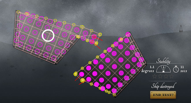
The ships you design in Full Steam Ahead are capable of breaking up if they hit the shore, sea floor, are overloaded or just badly shaped. A wide and weak ship can be broken up by the action of the waves too. To model this, I take the ship-shape that the user has drawn and chop it into squares on a grid. Then I add the beams that the user has specified around the edges. On top of all that I join adjacent hull cells and beams etc with weld joints. Each frame I check the stress at each joint. Over a limit specified by the materials in question, and I delete the joint and add some damage to the hull texture.
This approach is great because it deals with any situation thrown at it. If a ship is bent in half over a big wave, it will snap along the middle. If the tide goes out and it scrapes a big rock on the sea floor, it will break the hull in the right place. You can even add an engine that is too powerful and rips itself free of the hull at the right point.
What this doesn’t do however is sink. Buoyancy is based on the area below the water, so if a ship floats, so does a small chunk of that ship (as far as Box2D is concerned). To deal with this, the game keeps track of which edges of which chunks are nominally open to the sea. You can deliberately leave parts of the ship open (e.g, the deck) to save weight and cost. We also mark edges as open to the sea if their weld is deleted through being overstressed. If any open edge is under the height of the sea at that point, it starts to flood into the hull’s cell. As it floods I increase it’s density up to a limit, to simulate the extra weight of water inside the compartment.
Flooding a single cell works well, but feels unrealistic. Only the edges of the ship flood when exposed to water, and the rest stays dry. I tried just flooding every cell a little when the ship was leaking, but this leads to more unsatisfactory looking results. A ship open at just one end will sink evenly, rather than going down nose first. Also, a ship that breaks into two parts – one that floods and the other that is still seaworthy – still sinks both halves. The water does not ‘know’ that the two parts are disconnected.
The solution was to spread the water from each cell to its neighbour along the welds. If a weld is present, the water is slowly equalised between the two cells. If there is no weld, the water does not cross into the next cell. This means that a ship floods gradually from any damaged point, not necessarily evenly. A broken but seaworthy chunk may stay floating forever while another part could break off, flood and sink.
Sea
Box2D provides a built in Buoyancy Controller class which gives you a single perfectly straight water line across the world. It extends infinitely in either direction and does not support curves. It works by slicing shapes against the line, and measuring the portion under the water. That part is perfect for Full Steam Ahead, but I had to add the waves myself. The solution was to model the surface of the waves as a sum of multiple sine curves, all defined in the level designs. These are sampled and drawn to the screen as modified Starling Quad objects (they don’t have a texture, just an alpha colour). The modification is that they don’t have to be perfectly rectangular. Instead they are trapezoid columns, together modelling the top of the wave in segments.
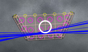 To compute the physics, each floating cell of the ship is given its own buoyancy controller (blue lines in the screenshot). Each frame, I update the controller by re-sampling the sea waves at the X position of the object. As far as each individual floating item is concerned, the sea is flat (although probably angled and moving over time). Aggregated together, the ship’s hull experiences a curved wave.
With any complex simulation like this, it is essential to be able to see what’s going on behind the scenes while developing. The screenshot below shows the cells of a broken ship in pink, with red lines indicating broken welds. Yellow lines indicate flooding points (filled in yellow if they are currently underwater). Pink circles show centre of mass of each cell, and have darker centres if they are more flooded. The large white circle shows the centre of the largest connected part of the ship, and is used to determine what the camera watches.


 RSS 2.0 full site