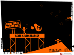
 Can you help Hanna pilot her chopper through 21 unique and puzzling levels? Use keyboard or mouse controls and fly your way to success.
Play Hanna in a Choppa
Postmortem:
For this game, I didn’t have any external clients. I didn’t have any final goal for it. I didn’t really have much of an initial goal for it. It evolved from almost nothing into something pretty special, almost by itself.
Hanna in a Choppa started life as Hanna on a Hoppa, which was going to be a physics game based on the latest version of my now fairly advanced AS2 physics engine. I’d just given it nice stable flat surfaces to bounce masses off, and they worked an absolute treat. I thought it would be hilariously funny if you played a sort of springy ragdoll called Hanna sat atop a space hopper, bouncing around off all sorts of surfaces and generally causing mayhem. I built the prototype in a short space of time, and discovered that it sucked. Bad. It turns out that space hoppers and physics games go together considerably less well than you might imagine. After fiddling with it for a while, I shelved the idea.
Later, whilst mulling over the name, I thought it’d be amusing to extend the punnage of the Hoppa into all sorts of other things. Hanna in a Choppa seemed like a good one, and I almost immediately had an idea of how to code up the helicopter in the physics engine. I threw a prototype together, and lo and behold it worked a treat.
Initially, the helicopter controls were inspired by an old Amiga game, Zeewolf. That had such an amazing feel to it, I wanted to do something similar, but in 2D. My controls worked and were mightily tactile, but suffered from the mouse wandering off-screen a bit. This is a virtually unsolvable issue in Flash, as you can’t constrain the mouse, but I could at least detect it and auto-pause the game, so it didn’t cause you to crash.
So on I went. I picked a simple in-your-face 2-tone graphical style mainly because I’m not great at drawing, but partly because it would perform superbly. And partly because it would hide overlapping object errors in the physics! From the cartoonish over the top style came the cartoonish over the top captions and level designs. The project grew and grew until about half the levels were done, and it had enough interface screens to show around to some friends for a bit of playtesting.
Disaster.
Nobody could get the hang of the controls. The beautiful tactile controls that I adored so much, and that I could fly with such finesse. All I wanted was to give that experience of harmony to the world, but nobody got it. Nobody understood. Everyone who tried, ended up stuck upside down in any nook or cranny.
I tweaked those controls. I added sensitivity settings, subtle self-righting, clever damping, non-linear response curves, all sorts. They all damaged the experience for me, and none helped for other people. I caved in and added key controls that drove the same force vectors that the mouse was attached to.
This was better. People could at least fly for a while now. For a while. Without any finesse, and bumping off walls a lot. On the plus side, now people were playing for long enough to appreciate the level design a little more. The fact that you could pick items up with a winch, push them around etc. The way each level presented a different challenge and task, not just a harder set of obsticles to fly through.
But it still wasn’t good enough. People got frustrated and still gave up quickly.
I caved a second time and added the key controls that you can play in-game today. You push right. The chopper flies right. You push up. It goes up. And so on. Finally it was accessable and everyone could play it. I didn’t like the idea of losing the mouse controls though, so kept them in and put the easier keys on an option.
An option that nobody played long enough to find.
So I added a new screen at the start of the game. New players were asked to make one choice – easy key controls, or hard mouse controls. A lot of people selected easy at this point and went on to have a lovely time. A significant number picked hard however, and within 30 seconds of gameplay hated the game. The curious thing here is that they never went into options at this point and changed back to easy. They just quit and went elsewhere.
So eventually, after a little bit of alone-time sobbing, I made the key controls the default. Most players would never go into the options menu and would never even try the trickier mouse option. It was the right choice. For certain. I haven’t read a single comment on the web from someone saying they enjoyed the mouse controls. A few people have commented on how tough it is on the mouse though, but they’ve already played the game enough on keys to not hate it.
Anyway, the game was now more or less complete. A few more levels remained to be built, and a couple of interface screens needed a bit of polish. Next came the love.
I’d been deliberately building love into Hanna in a Choppa as I went along. Little humorous comments and references in the levels seemed to go a long way with the playtesters, so I made sure they were all as amusing as possible. I ensured there was plenty of diversity in the levels, rather than increasing difficulty. That worked a treat too. People would keep playing to see what madness they had to perform next, rather than to improve at the game.
Adding the love was all about increasing the number of those little features that make people smile. So, for the hardcore gamers I added achievements. They announce themselves visibly when you get them, and you’re more or less bound to get a few by accident along the way as some of them are pretty easy (on purpose). Then, when you’ve completed all the levels and are hungry for more, you remember the achievements and hunt around for the screen that shows you what else is available to collect. I made some of them dead easy. Some flippant and silly, and some rock solid hard (like perfecting all levels – flying without touching the walls at all). This meant that people could play to whatever level they fancied. The elite gamers could get everything. Mid-range players could get a fair chunk but miss a few, and amateurs could drop out after beating all the levels. It’s a sort of self-adjusting difficulty curve in a way.
Then there was things like the developer message screen. I find feedback and stats unbelievably useful to get to know how a typical gamer thinks and reacts to things. If I ask for feedback, I know I’ll get a lot of rubbish, but there will be a few gems in there that’ll really teach me something. In Hanna, I made it an achievement to send me a message. Well, gosh, I got a lot of messages! And still get a lot of messages. That’s fine though, and there have indeed been some gems.
The “never press” button was well received too. I thought when I made it that about half the players would like it, thinking it cute, and the other half would think it entirely pointless and rant about it. Not so. Everyone who commented loved it, or apologised for making it cry. It seems people really do like sillyness for sillyness’s sake.
The rich feedback let me summarise the main criticisms against the game. I’ll respond here…
- It’s a bit slow on my old PC: Yep, fair comment. The physics engine is fairly heavy, and does a lot of mathematics. AS2 isn’t great at this (AS3 is considerably better of course, but I don’t work with it yet). A fairly modern machine should make a sensible framerate, but if it chugs on yours, sorry.
- There’s no quality settings: I know. That’s because a low quality mode wouldn’t help performance. In most Flash games, rendering all the pretty effects slows down your computer. Hanna has very few pretty effects, but does do lots of codey maths. The Flash quality settings just change things antialiasing, which for Hanna it can do in its sleep.
- The wench is a bit fidgety: Here’s a dictionary. Work out what you just said to me, then I’ll talk to you.
- Oh. The winch is a bit fidgety: Ah I see what you mean now. Yes, it is. Sorry. I should have done something about it really, but the physics engine isn’t really up to doing short bits of rope. It’s a totally fair comment.
- Level 8 is hard to perfect: It is on the crappy key controls, yes. If you learn the mouse like a responsible gamer should, you just flip upside down and throttle towards the fan in complete control. I suppose you’re right though, given all the stuff I wrote about above.
- Level 19 is hard to perfect: Yep, my fault again. On the mouse it’s a bit easier, but I know you don’t want to hear that. I should have made the survival space a bit bigger really, but that would have added three more physics surfaces to a level that’s already doing rather too much for ideal performance. Compromises were made.
- Level 20 is impossible: Really? Are you sure? Because I can do it pretty easily. You did remember your chopper has a wench winch installed, right? I mean, you have only been using it for 19 straight levels, so I see how it might slip your mind…
- All that orange hurts my eyes: Fair comment, hope I haven’t done you any permanant damage.
- There’s no end of game reward: Actually, there is, but only when you get all the achievements. To be fair you’re right though, I should have added something a little special for when you beat every level. My mistake. Again.
- Forcing me to write to you is lame: Hey, I wrote you a game for free that entertained you for about an hour! Can’t you write even a couple of kind words back? Bloody ingrates.
- Can you tell me how to make games? I’m just starting out but I’m 95% done making this amazing RPG but I can’t figure out gotoAndStop: Might I suggest the F1 key in Flash?
- this game suxxors u suck worst gaim evur 1/1000000000!!!!!!1: Learn to spell, learn to punctuate, learn some respect, create something worthwhile yourself, then we can talk. Thanks.
Lessons:
- Give creative things room to breathe
- Don’t get attached to any aspect of your game. If playtesters say a feature sucks, rip it out and put something better in. Just imagine multiplying ‘it sucks’ by all the people who will play your game. That’s a lot of suckage!
- Anything that turns a player off in the first 30 seconds will ruin your game’s play figures
- People don’t read instructions
- That one tiny piece of level design that isn’t quite right yet – FIX IT! Fix it or else. Fix it, or people will moan at you forever more about it
- Inject love into every corner of your creations. It pays back a thousandfold
- If you make it an achievement to send you a message, be prepared for hundreds of thousands of messages!
- Take the time to make the sound-stage work well
- A surprising number of people don’t know the syntactic difference between a winch, a wench and a wrench! My inbox is pretty comical at times
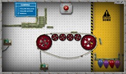
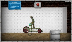
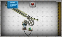
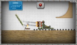
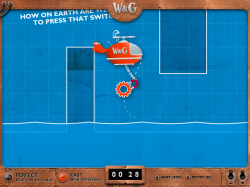
 Unleash your inner inventor and build crazy contraptions in the BAFTA winning Wallace and Gromit game, Wallace’s Workshop. You’ll need to use your intelligence, imagination and cunning to build everything from battery powered cars and rocket powered sleds, to Heath-Robinson contraptions and giant trebuchets!

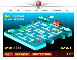 Dodge the meanies and collect all the dots in this isometric Pacman-style game. It’s not massively original, but the graphics and sound are lovely, and it plays great too. Collect the ingredients for a big breakfast amongst the 10 uniquely psychadellic levels to get the chance to take out the baddie trucks. Combos earn you bigger points if you can manage them without getting caught.
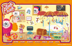
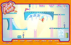 Platform game: Use cursor keys to guide Zotti-Motti through this platform-puzzle game. There are only six levels, but each one is carefully crafted to have unique puzzles and items to solve. The idea was to make the player think around the cartoon physics of the game and use the objects they find to help progress.
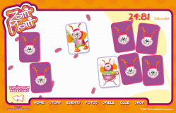 Pairs game: Nothing too special here. Just the traditional matching pairs game that appears everywhere on the web. This version was based on the Sonic Rush Adventure game I built previously, so you can turn cards over as fast as you like and it keeps track nicely. You also get a little bit of sound when you match a couple of instruments too. It’s a nice little game, but won’t hold your attention for long.
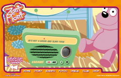 Karaoke: The client wanted the Zotti-Motti song to be played on the radio in the room. Easy enough of course. Then they wanted the lyrics to display in time with the music – a little harder. Then they wanted a bouncing ball to run along with the words and syllables, all in perfect time too. Now we’re into the realm of a technical challenge!
 RSS 2.0 full site