Posts Tagged ‘best-work’

Chronicles of Narnia: Reepicheep Run

Monday, May 12th, 2008
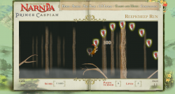
reepicheep-run-gameUse the mouse to control Reepicheep the heroic mouse in this tricky skill game. Click somewhere above Reepicheep to make him leap towards the mouse. In the air, move the mouse in-front or behind him to apply aftertouch to your jump’s path.

Collect powerups to jump further, have more control in the air and gain extra lives.

Postmortem:

This game is one I rather like personally. It’s got on of my favorite things in a computer game – a tactile main character. By that I mean you have a certain subtlty and finesse in the character’s control that rewards patient learning and practice.

Unfortunately, these things are exactly what web-game players typically don’t want to do. They want to leap straight in and be acceptably good at the game, not to fall off every branch with no idea what they’re doing wrong.  If a random web player can’t get into the game straight away, they’ll almost certainly go elsewhere. There’s no shortage of other games out there to play.

A second issue caused trouble with this game too. Compounding the fact that it’s a pretty tough game was the fact that the client kept wanting more difficulty added to it. First it was extended to be considerably longer (which wasn’t a bad thing). Next they wanted to speed the auto-scroll up as time went by (which makes it become very high pressure towards the end). Then they wanted fewer lives and fewer life power-ups (I was generous with them as it’s so easy to die). Then they asked us to add branches that break if you sit on them too long (adding even more pressure and no chance for a breather). Eventually they wanted arrows shooting through the branches at random, which we made a stand against since you have very little chance to avoid them. It’s a game about planning your next move, rather than reacting. Once you’re in the air, you can only make fairly small adjustments. In no way could you dodge fast moving arrows!

Finally, when we discovered that lots of people couldn’t get the hang of jumping, we asked the client if we could build a jump preview line that showed the rough path of the jump before you clicked. They were heavily against this idea, dispite my thinking it would help considerably with getting new players to a competent standard rapidly.

Dispite the added difficulty, I still like this game and still enjoy playing it, which is unusual for games I’ve worked closely on. Usually you play a game to death during its development, and are happy not to see it again afterwards. Not so with this one. I still come back to it from time to time to see if I can still perfect those jumps.

The character’s movement comprises a few subtle elements. Firstly, the mouse takes his initial jump direction from the angle to the cursor. His jump force is calculated from the distance, so you can do small adjusting hops, nimble jumps to a nearby branch, or huge leaps across the screen. Then, the spring motion of the branch is added onto that initial force, so you can time your jump with the release of the energy in the branch to go higher or further, or the opposite – and do a minimal jump. You can leap up through branches then land on them, or leap down through branches to a lower level and add energy to your next jump. In mid-air, there’s an affect of aftertouch where Reepicheep has a slight acceleration towards the mouse cursor, so you can bend and curve his jump after you’ve taken off. You can power up all these abilities too, with the pickups strewn around. Finally, if you get to the right hand edge of the screen you can push-scroll the level, so it’s even possible to speedrun the game!

Collision detection was an issue in build. Branches are necessarily thin things, and the character moves necessarily fast! Tunneling through branches is simply unacceptable in this case as you’re depending on hitting them for survival throughout the game. The solution was to scan every pixel between Reepicheep’s previous position and his next, and test each for collision with the branches so that you collide with even the thinnest hint of a branch. To keep everything running well, the forrest is divided into lots of short segments, each is attached to the stage just before it is needed, scrolled through view then removed as it goes out of sight. Only branches in the current segment are tested for collisions of course. New segments are attached automatically when required, and each segment contains power ups right there on the timeline as required. A discovery algorithm runs searches through instance names at runtime as segments are attached, learning what items exist and setting them up as appropriate. This works really well, and far better than having metadata in the code that has to be kept in sync with what’s on stage, or worse, coordinates for powerups stored in the code. It’s just so much easier to adjust – you just chuck a new powerup on stage from the library, and give it an appropriate instance name. Recompile and it’s there in the game, functioning.
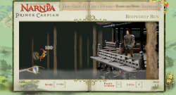
reepicheep-run-endThe final part of the forrest contains a large treehouse that you make one final heroic leap to, then squeak your important message to Prince Caspian directly. Granted, not many people are going to get this far as it’s a pretty tough game, but those that do should at least feel like there’s a proper conclusion, a bit of a point to it all. As a game developer it’s easy to overlook how important this is as it really adds nothing to the gameplay mechanic at all. It’s just a big bitmap and some special case coding at the end, rather than a different challenge etc. It’s hard to justify why we’d want to build it, but the feeling of closure and reward for the player is immesurably important.

Lessons:

  • Tricky yet rich control mechanisms aren’t generally a good idea. Extensive user training is required, which most people won’t bother to work through
  • A proper end goal is a great way to finish a game. Just cutting at a given point really isn’t! This one does it well, with the final treehouse with Prince Caspian being a really solid final point
  • The Flash IDE is still a great level design tool
Speed Racer Chaser

Friday, April 25th, 2008

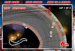
speedracerUse cursor keys to drive in this high-speed racing game. Hit spacebar to deploy your car’s weapon, and shift to launch into the air. Can you beat all the other players, which are recordings of other real human drivers?

Postmortem:

Ah, a chance to do a pure arcade racing game, with actual racing cars rather than trollies or reindeer or airport baggage karts! Brilliant. I was determined to make a really good Flash racing game, with arcade but partially realistic handling, fun tracks, weapons and a little bit of a multiplayer twist.

AI in racing games is hard. Even the big name consold games don’t get it right, and have either unrealistically good AI drivers or comically bad ones. In a lot of games, the computer AI just bulldozes through your car sticking to its pre-programmed lines like a limpet. It feels unfair, and it’s not good enough! Rather than build a crappy AI for this game, I came up with the idea of recording people’s gameplay whilst they were racing and storing them on the server (stored by their starting position and overall performance). Then, when a new game is started, the server puts you in a random grid position and sends out 8 replays – one from each remaining grid slot. They are picked at random, but in a skewed way so that you play against a mix of the best, worst and mediocre players out there. That’s self-ballancing – the range of opponents you meet is determined by the actual range of skills out there, from good to bad. There is a par time over which your score isn’t recorded to avoid skewing the results towards people who just leave the game running forever, but other than that it’s a level playing field. This strategy really worked for this game, and everyone gets opponents who play roughly at their level – and some who are faster that they can work towards beating.

The big problem with storing and serving replays is that there’s a lot of data. AS2 doesn’t handle binary data very well except in pre-given formats that are delt with internally like jpegs, sounds or SWFs. So, a replay consists of a great long string of car coordinates etc in a text format. There’s very little encoding, as I found that simply processing the raw strings was enough of a task for Flash, let alone processing an encoding on top of that. I’d have liked to have compressed the strings, or base-64 encoded them or similar, but it just wasn’t feasable. The remaining problem was that each play of the game required about a 1mb download of replay data from the server, which was very bad for bandwidth when the number of plays started to climb dramatically. We had to trim back the number of replays sent to the client to just 4, then 2, then none as the load increased. The URL presented here allows you to have all 8 opponents switched on, as it’s going to be pretty low-load from this website.

Car handling was a major area of improvement in this game over previous racers I’ve built. The cars have a single giant virtual tyre that they run on, which resists sideways motion and promotes forwards motion. When the car turns, this virtual tyre turns with it, causing the car to grip and change direction. This is reasonably analogous to the way a real car turns in many ways, and leads to a decent feel. Rather than programming in effects like sliding if you turn too fast, or if you land a jump facing sideways to the direction of travel, it just naturally falls out of the physics model. Likewise, slow speed turning works better this way too. The model is also very tunable to different car styles, so some are fast but have little grip, some have too much grip and are hard to control, some are ballanced and so on. There is no ‘best’ car, although there tends to be a couple per track that people end up using predominantly over the others.

A big part of the Speed Racer film was the twisting looping jumping corkscrewing tracks. In a 2D game you’re limited to how far you can recreate these effects, but the tracks certainly do have these stunts in them, which is a nice effect. Even better, you can short-cut them in cunning ways using your car’s jump ability, which adds a little depth.

Another requirement from the film is the use of car-to-car weapons. This poses a problem with the replay technology, as a replay is by its nature an asynchronous event. It does not contain data saying how the human player reacted to being hit by a weapon at any random point. The simple rules I adopted were to never fire weapons at the human player (ie, weapon usage is not recorded in the replays), and if a replay car gets hit, to simply spin it around in a straight line along its direction of travel until it falls off the track edge.

The other thing you can’t do with a replay is car-to-car collisions. You can’t purturb the replay car from its course, as that would put you ‘off’ the replay line with no obvious way to get back on it. You can’t just slow or collide the human player either, since that would get recorded in their replay and when played back to another player, would look strange as they randomly react to a collision that didn’t happen. There was nothing better I could think of than simply allowing cars to overlap. Not completely satisfying, but that’s all I could do.

As cheating features quite heavily in the film races, I’ve deliberately allowed for it in the game. If you use your car’s jump facility carefully, there are a number of places you can take shortcuts by jumping sections of track. It’s risky of course – you stand a fair chance of falling off the track instead of saving time, but that’s good for ballance.

There’s an issue with the pace of the game and some of the cars. If the player picks one of the faster cars, it’s hard to see what’s coming and to keep the car on the track whilst cornering. Falling off track is punishing to your time at least, but doesn’t throw you out of the race because it’s really rather easy to do. If you opt for a slower, more controllable car, you stand less chance of keeping up overall.

Performance is vital in a game like this. Keeping the framerate high was always a priority, right from the beginning. There’s a huge amount of stuff bitmap-cached to aid this. The background is a short loop, scrolled around as required and flipped to the other side of the loop when needed. There are a few layers of it, but each is just a series of bitmap cached effects. The track itself is created from segments at the start of the game. The track exists as metadata in the code, as a simple array of segment IDs. The IDs are itterated as the track is created at the start, and each segment is instantiated into its own movieclip from an end-marker clip in the previous segment, then bitmap-cached. This allows for much bigger tracks, as it neatly gets round the 2880px bitmap limits by having lots of smaller ones instead. It does take a while to produce the track at the start though. This is what’s happening behind the silver “creating track” screen before the race. Without the bitmap caching, the length of time that screen appears for (several seconds on most machines) would happen to be the in-game framerate too!

Generating the track in segments gives me a nice convenient way to tell how far through the track each car is. They are hit-tested against the segment they are in and the next one too, and their position is updated when they are in the ‘next’ segment. If they are over no piece of track, their position is hit-tested against all segments as they may be about to perform a shortcut jump. Whilst in the air however, they are considered to be on the piece of track they last touched. That’s where they get reset to if they crash, and where they are positioned in terms of the race order.

Lessons:

  • Multiply up the bandwidth for a typical gameplay by a best-case number of plays to see if it’ll work with your hosting provision!
  • Add subtle touches for more depth
  • Processing big strings in Flash is horribly inefficient
  • When used right, bitmap caching saves huge amounts of CPU time

Isabel Bookbinder Outfit Designer

Monday, April 14th, 2008

isabel-bookbinder-outfit-designerUse your mouse to design Isabel Bookbinder a fashionable outfit. You can save it into a gallery for all to see too. Click “outfit designer” to get started.

Dressup toys aren’t the most exciting of things for developers to build. It’s basically a drag+drop mechanism, and a bunch of graphics. That’s normally it. In this case however, I decided to add a little sparkle to the way things moved on screen by integrating my AS2 physics engine into the clothing. When you scroll the wardrobe, the items all dangle and sway in a satisfying manner. Hangers without clothing will rock about considerably more, and items will dangle from the mouse rather than just sticking firmly. It all adds a level of tactility that isn’t present in most dressup games.

Teenage Mutant Ninja Turtles

Wednesday, December 19th, 2007

teenage-mutant-ninja-turtlesTake control of your favorite Teenage Mutant Ninja Turtle in this classic beat-em-up. Use cursor keys and C + D to fight increasingly tough stop-motion baddies photographed from the real toys.
Postmortem:

The Street Fighter 2 games and their endless series of sequels have long been favorites of mine. There’s something about the feel and the flow that is just right in those games. Skill really plays a part, which I just haven’t found to be the case in a lot of Street Fighter’s competitors. So, when we decided to build a beat-em-up for the new Turtles movie (which is frighteningly bad by the way, don’t bother watching it if at all possible), I was quite excited.

The timeframe for this game was a little over a week – 6 or 7 days of code work alongside a day or so of photographing the characters in absurd ninja poses. It turned out an illness shot around the office for most of that week too. I don’t get ill a lot, but this particular bug hit me hard and I distinctly remember coding away at the game with my head slumped on the desk just in front of the keyboard, peering up at the screen to see what I’d typed! It’s a minor miracle that the game even got finished, let alone was a half-competent fighting game.

I was determined to get a lot of my favorite parts from the Street Fighter games into this, and for the most part I think, managed it. I wanted all the moves to be different from character to character (achieved). I wanted special moves based on quick performance of key-combos (achieved). I wanted freeform hit-combos against the opposing player (achieved). I wanted the AI player to put up a decent fight (achieved), and to be able to play to the character’s strengths in set-combos (achieved). I wanted it to play fairly, so the computer had its own set of virtual controls that it pressed and clicked just as if it were a human player (achieved).

In fact, that last feature means that with a bit of code hacking, you could play as any character, and the computer could play as any character. You could arrange for computer-Vs-computer battles too, which were fun. That and a high framerate actually made for an excellent character ballancing tool – I ran lots of computer-Vs-computer battles to test out the various pairings, as well as playing lots of the combinations too.

We hit upon the idea to use the real plastic figures, and play the game out as if it were literally a fight between the toys themselves. This works fairly well, but took a lot of work to take the photographs and process them into usable graphics. Also, the range of movement of some of the toys’ limbs left a lot to be desired. The turtles themselves are largely OK, but the baddies are mixed quality at best! The lady fighter in particular looks gangly and strange in a lot of her moves. I’d have liked more animation frames too, but we just didn’t have time to prepare all the extra graphics we’d have needed.

The game was widely played, and received mixed ratings. Lots of people ‘got’ it, saw how it was similar to Street Fighter and enjoyed it. Lots more were used to the more button-bashing type of fighting game, and didn’t like it at all. That’s fair comment really – and represents a failing of the game to lead them into the right techniques and strategies. Perhaps more of a training mode than it ended up with would have been helpful here.

Lessons:

  • Aim high, and you might just hit!
  • Don’t be scared of taking on a daunting challenge if you’re determined enough to see it through
  • You can’t please everyone all the time

Travis: Trolley Dash

Friday, March 30th, 2007

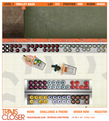
travisUse the cursor keys to race your trolley around the supermarket in this Travis oriented racing game.
Postmortem:

This game was written as a development of the Unaccompanied Minors racing game, and used much the same engine underneath. The major change here is that the trolley doesn’t have to behave like a car, and as such needed to be much more slippy-slidey. The simple way to achieve that is with a basic vectored thrust and momentum movement model – something I’ve written many times over for space rocket style games in the past. It’s easy to get it feeling great for rockets (and trolleys), although it really doesn’t feel right for anything but the slipperiest of cars (think ice-racing rally cars, for example).

There are other enhancements over the Unaccompanied Minors game here too. The tracks have a clearly marked out path you can follow, so you needn’t get lost at every corner. Track design in general is much better too: There are shortcuts for the observent to find, pickups to collect for bonus points and the game runs better too due to better prepared graphics (the artist for this one followed my direction perfectly in terms of what would affect performance).

The mood of the game is a little depressing for my taste. The yellow floors and dimly lit store rooms remind me of the bad strip lighting in stores like Lidl and Aldi. That’s on purpose of course – it’s like that to fit in with the Travis song/video, but it still drags the mood down a bit for a racing game.

The biggest mistake in this game however is the collision response. It’ s much improved over Unaccompanied Minors, and you can do a lot more when you have a momentum vector hanging around that you can modify. The edge approximation still sucks however, and it’s not hard to find yourself accidentily rotated into a wall. There are all sorts of horrible special-case hacks in the code for recovering from such incidents, but luckily they don’t have to be used much, unless the player attempts some of the tighter shortcuts where it’s easier to get stuck.

Lessons:

  • Half-decent collision response still isn’t good enough!
  • Decent performance makes everything feel better
  • Everybody likes sliding around

The Reef Scene Builder

Tuesday, February 6th, 2007

the-reefCreate your own underwater scene from the film ‘The Reef’ with this tool. Once you’re done, save out a beautiful high quality wallpaper sized image of your handiwork.

Visit The Reef Scene Builder

Iron Maiden: Different World

Thursday, December 14th, 2006

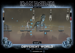
iron-maiden-different-worldUse cursor keys and mouse to fill the screen with bullets in this platform-shoot-em-up. Collect as many of the blue power-ups as you can to upgrade your puny starting gun into a harm-producing device of chaos. Double jump if you need to, and press down to reload in quiet moments.
Postmortem:

After the success of the first Iron Maiden game we built, EMI comissioned a second. This is the result – a fast paced platform shoot-em-up. I had a specific goal in mind from the start, and that was to make it as over-the-top as possible. I wanted to be able to upgrade the gun tens of levels so that it goes from a weedy pop-gun to a bullet spitting death dealing mayhem device. I achieved that, but somehow a screenful of bullets still wasn’t quite as satisfying as I’d wanted. The solution was a mega-powerup that gives you all the max gun settings, at double the firing rate and with a rose-tinted death-glow over everything. That works quite well!

I think one reason the gun isn’t quite as satisfying as I’d wanted is simply that it doesn’t make much noise. We tried out various sound effects, and none really fitted. Plus, they dominated the sound-stage completely since you’re pretty much firing the entire time you’re playing.

The platforming element works remarkably well for the simplicity behind the scenes. Everything is based on a simple hit-shape that defines where the ground is, and care is taken that you can’t fall so fast as to tunnel through it. The sliding trapdoors are then just animations in that hit shape. So simple! The character can climb gentle slopes and stairs, which is essential if the player isn’t to get stuck on the slightest of objects.

The automatic, fixed pace level scrolling works well to keep the pressure on. It wouldn’t suit all games of course, but it serves its purpose well here. The only downside is that the character animation moonwalks a lot of the time!

Baddie AI is ultra simple too. They are generated at fixed positions in the game, and follow a set path. They shoot at random, but directly towards the player. This is enough in this game’s case to produce plenty of challenge, since there’s lots going on.

We struggled graphically for an explosion sequence. They always just looks pasted on top, rather than being part of the action. In the end, we settled on not having one and instead flashing the baddies brightly for a second and making them fall apart. The result works well!

Whilst this game was well received, it wasn’t anything like as widely played as the first Iron Maiden game we built. I never quite understood why, but very few portals seemed to pick up on it. I don’t think it was seeded any differently to the other game. It was still a success, but nothing like as strong as A Matter of Life and Death.

Lessons:

  • If your game contains a dominant power-up, make sure it is given at designed points in the game rather than at random
  • Everyone loves to fill a screen with bullets
  • Don’t force your character to stop shooting back whilst he’s taking damage!
  • Spend the time to make the character climb up slopes and stairs automatically. It’s well worth it for playability
  • Double jumps add to the fun factor and controlability of a character

Robo Range game

Friday, October 27th, 2006

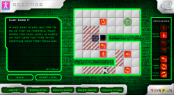
roborangeSolve the puzzles by dropping command tiles for the robot to follow in this unique puzzle game. Compete worldwide for the fastest times over each set of levels and see your name on the highscore table!
Click “Robo Game” at the bottom to get into the game. If you want to play the advanced levels, the access code is 3003.

Postmortem:

I was allowed a lot of freedom in creating this game, and came up with the concept from scratch. The idea of using a primative form of programming to promote a toy that would appeal to technically minded kids worked well. There’s a little added depth in the game in the fact that you can work towards a most efficient solution, as well as just completing each puzzle.

Whilst it looks like a pure logic game, astute players will spot that the timer starts as soon as you drop your first command. This means actually there’s a certain amount of skill required to get fast times, as your first tile-drop should be on the robot itself to get it walking as soon as possible. This also means there’s a best-possible solution for each level. I really like these subtlties and they interplay with each other to create a deeper and more unique experience.

The initial levels are designed to teach the user how to drive the robot around, but are not meant to be entirely trivial still. Each concept is introduced separately which is a good thing, and a puzzle that isn’t necessarily instantly obvious is given at the same time. The idea was to avoid the boredom of learning that often comes with games like this before the real challenges.

The graphics for this game were done by a collegue, and are generally excellent. There are a couple of exceptions however: holes don’t look quite enough like holes, and crates don’t quite look moveable enough. The crates issue is partly down to the fact that you have to be able to see what’s under them at various points in the game, but the holes could have been better. Specifically, they should afford the possibility of dropping not just the main character but also crates into them, since disposing of crates is essential for some of the puzzles.

Two big mistakes damaged this game’s success severely. The first is that we were told to lock the third (and best) set of puzzles behind a secret code. The code was distributed on notes on the shelves in Toys-R-Us stores. It turns out nobody (and I really mean nobody) finds these and takes them home to try out. I calculated from the stats that the locked content was played by just 7 real players in the life of the campaign! It’s a real shame, as people who played the initial levels and were hungry for more could see that more existed, but couldn’t get at it to play, so would have been frustrated.

The second big mistake was that the game was never seeded widely. Therefore very few people got to actually play the game because nobody knew it existed! For one of my favorite personal game builds, it’s quite a sad tale really. The site was visited by around 3000 visitors in the life of the campaign, which is pathetic by any standards! I plan to make a spin-off game using the same concept one day, and to promote it using the modern Flash distribution websites.

I also made a smaller design mistake in the final locked level. You have to find a way to re-use one of the tiles. Turns out a minor gameplay bug introduced by the graphic designer means you can pick up a tile whilst it’s dissappearing, just after it has been executed by the robot. You can then re-use it elsewhere! Dispite hinting at that in the level’s text, it was still unfair to expect the player to find that. As a result, very few of the very few people that found the final level code, have completed the final level!

Lessons:

  • If you have highscores in your game, make sure that it’s always going to be possible to improve by a tiny bit. In this game, there’s a perfect performance for each level that’s pretty easy to do once you know how. The first set of highscore entries are all identical, which isn’t great for promoting competition.
  • Don’t hide away content behind difficult to achieve codes unless you want it to go unplayed by most.
  • Agressively pimp your games to as many places as possible to seed them for traffic. A game that nobody plays is just a waste of development time!
  • Don’t build dirty-tricks into level design. They can exist as a cunning way for the astute player to improve their score, but should never be required to complete a level.

Iron Maiden: A Matter of Life and Death

Wednesday, August 30th, 2006

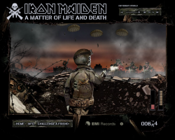
iron-maiden-a-matter-of-life-and-deathUse the cursor keys and your mouse in this all-action shoot ’em up. Kill anything that moves, including zombies, parachutists and more. Don’t forget to reload by ducking behind the defensive wall.

This was my first big game with Hyperlaunch, promoting Iron Maiden’s new album ‘A Matter of Life and Death’. A build time of a couple of weeks allowed us to push the boat out more than we had done before, and add effects and flair for the sake of polish, rather than just getting the minimum done. The result is a game that plays well, and looks and sounds great. It was played by over 3 million people worldwide, which was a huge success for the campaign.

Postmortem:

The game features destructable baddies that you can hit in all sorts of places for different effects and scores. For example, shooting a parachute a number of times makes it collapse, but you can get more points for hitting the tiny zombie figure on the chute itself. He can even be seen dropping his rifle and slumping on his ropes, and you can still take out the chute for even more points. This worked really well, and people who liked the game and wanted a deeper experience would learn how to maximise their points from each baddie.

There are 3D bullets too! I spent a fair bit of time getting them just right, including having them drop off in their trajectory in the far distance. The interraction between 3D bullets and the essentially 2D game engine worked surprisingly well too, with bullets being hit-tested as they passed through a particular Z-depth. I expected that to feel wrong and look unfair, but you just don’t notice what a faux-effect it is when playing! In fact, this is a game entirely made by it’s gutteral feel. Essentially all there is to do is click on targets that pop up, and reload occasionally. Having the atmosphere just right really makes it work.

The bullets even ricochet off objects. On the third level, this is really noticable with the tank turret. Bouncing bullets can still hit baddies, and it can be a surprisingly effective way to take things like parachutes out. Again, these tiny subtle features all add to the overall experience and help produce depth that otherwise wouldn’t exist.

On reflection now, the sound stage is a little overpowered by the music. I spent quite a bit of time getting things like the ratatatat of the machine gun just right, and it gets drowned out by the Iron Maiden song. Not that I don’t like the song of course, it’s excellent!

This game really reflects how essential a good graphic artist is to a project. The artist involved was superb, not just in his artistry but also in understanding the requirements I gave him in terms of how I was going to build the game. I’ve worked with lots of artists who can produce a pretty picture of a game, but only the top few can produce it in such a way that it’s then easy to convert it into working software. It’s not just about organising assets to be easy to work with (although that does help), it’s also about things like effeciency of design so that good-looking effects can be built up from a minimum of runtime elements, which helps keep performance brisk.

The only bit of artistry that didn’t quite work as we’d have liked was Eddie’s gun-arm. As it bends around the screen, it flips to some pretty unnatural and disturbing looking angles!

Lessons learned:

  • Add subtlty in gameplay wherever possible
  • Work with the best graphic artist available for maximum win!
  • A big name client helps considerably