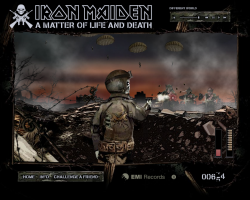
 Use the cursor keys and your mouse in this all-action shoot ’em up. Kill anything that moves, including zombies, parachutists and more. Don’t forget to reload by ducking behind the defensive wall.
This was my first big game with Hyperlaunch, promoting Iron Maiden’s new album ‘A Matter of Life and Death’. A build time of a couple of weeks allowed us to push the boat out more than we had done before, and add effects and flair for the sake of polish, rather than just getting the minimum done. The result is a game that plays well, and looks and sounds great. It was played by over 3 million people worldwide, which was a huge success for the campaign.
Postmortem:
The game features destructable baddies that you can hit in all sorts of places for different effects and scores. For example, shooting a parachute a number of times makes it collapse, but you can get more points for hitting the tiny zombie figure on the chute itself. He can even be seen dropping his rifle and slumping on his ropes, and you can still take out the chute for even more points. This worked really well, and people who liked the game and wanted a deeper experience would learn how to maximise their points from each baddie.
There are 3D bullets too! I spent a fair bit of time getting them just right, including having them drop off in their trajectory in the far distance. The interraction between 3D bullets and the essentially 2D game engine worked surprisingly well too, with bullets being hit-tested as they passed through a particular Z-depth. I expected that to feel wrong and look unfair, but you just don’t notice what a faux-effect it is when playing! In fact, this is a game entirely made by it’s gutteral feel. Essentially all there is to do is click on targets that pop up, and reload occasionally. Having the atmosphere just right really makes it work.
The bullets even ricochet off objects. On the third level, this is really noticable with the tank turret. Bouncing bullets can still hit baddies, and it can be a surprisingly effective way to take things like parachutes out. Again, these tiny subtle features all add to the overall experience and help produce depth that otherwise wouldn’t exist.
On reflection now, the sound stage is a little overpowered by the music. I spent quite a bit of time getting things like the ratatatat of the machine gun just right, and it gets drowned out by the Iron Maiden song. Not that I don’t like the song of course, it’s excellent!
This game really reflects how essential a good graphic artist is to a project. The artist involved was superb, not just in his artistry but also in understanding the requirements I gave him in terms of how I was going to build the game. I’ve worked with lots of artists who can produce a pretty picture of a game, but only the top few can produce it in such a way that it’s then easy to convert it into working software. It’s not just about organising assets to be easy to work with (although that does help), it’s also about things like effeciency of design so that good-looking effects can be built up from a minimum of runtime elements, which helps keep performance brisk.
The only bit of artistry that didn’t quite work as we’d have liked was Eddie’s gun-arm. As it bends around the screen, it flips to some pretty unnatural and disturbing looking angles!
Lessons learned:
- Add subtlty in gameplay wherever possible
- Work with the best graphic artist available for maximum win!
- A big name client helps considerably
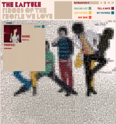 To promote The Rapture’s album ‘Pieces of the People We Love’, I created this microsite where fans could upload their image and a small profile to the band’s site. Their image became a part of a picture of the band. This really worked well with the album name, as people who uploaded a photo literally became pieces of the people loved by the band.
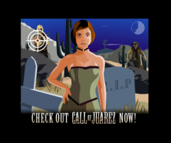 Use your mouse to shoot the baddies and avoid the maidens in this minigame promoting the Call of Juarez computer game.
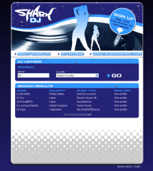 A simple database site for the Shark energy drink. You can register as a DJ and people needing DJ’s can find you!
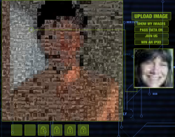 This microsite was produced to promote the film ‘A Scanner Darkly’. As more people upload their images to the system, an overall image begins to form from the mosaic of smaller photos.
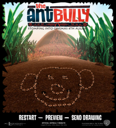 This webtoy was built to promote the Ant Bully film. You get to draw on the ground with a stick, then send your picture to a friend, where it is recreated via the medium of crawling ants!
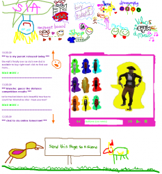 I created this band site for the singer Sia. Her unusual artistic style was brought into the site by making everything look like a 3 year old child drew it!
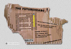 I created this wordsearch to help the band The Futureheads promote their latest tour. Find the tour locations in the wordsearch to get the details.
 To promote The Crimea’s single ‘Lottery Winners on Acid’, I helped build this competion microsite. The competition is long closed now, but you can still visit the site. The competition had a basic level of cheat protection, which actually worked in practice as one person tried to claim a prize for themselves that they weren’t eligable for!
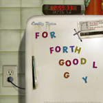 I built this spooky fridge-magnet game to promote the Emily Rose DVD release. You had to try and spell a phrase from the magnets before the clock strikes 3am and all hell breaks loose.
 RSS 2.0 full site