Robo Range game
Friday, October 27th, 2006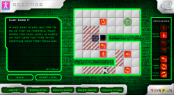 Solve the puzzles by dropping command tiles for the robot to follow in this unique puzzle game. Compete worldwide for the fastest times over each set of levels and see your name on the highscore table!
Click “Robo Game” at the bottom to get into the game. If you want to play the advanced levels, the access code is 3003.
Postmortem:
I was allowed a lot of freedom in creating this game, and came up with the concept from scratch. The idea of using a primative form of programming to promote a toy that would appeal to technically minded kids worked well. There’s a little added depth in the game in the fact that you can work towards a most efficient solution, as well as just completing each puzzle.
Whilst it looks like a pure logic game, astute players will spot that the timer starts as soon as you drop your first command. This means actually there’s a certain amount of skill required to get fast times, as your first tile-drop should be on the robot itself to get it walking as soon as possible. This also means there’s a best-possible solution for each level. I really like these subtlties and they interplay with each other to create a deeper and more unique experience.
The initial levels are designed to teach the user how to drive the robot around, but are not meant to be entirely trivial still. Each concept is introduced separately which is a good thing, and a puzzle that isn’t necessarily instantly obvious is given at the same time. The idea was to avoid the boredom of learning that often comes with games like this before the real challenges.
The graphics for this game were done by a collegue, and are generally excellent. There are a couple of exceptions however: holes don’t look quite enough like holes, and crates don’t quite look moveable enough. The crates issue is partly down to the fact that you have to be able to see what’s under them at various points in the game, but the holes could have been better. Specifically, they should afford the possibility of dropping not just the main character but also crates into them, since disposing of crates is essential for some of the puzzles.
Two big mistakes damaged this game’s success severely. The first is that we were told to lock the third (and best) set of puzzles behind a secret code. The code was distributed on notes on the shelves in Toys-R-Us stores. It turns out nobody (and I really mean nobody) finds these and takes them home to try out. I calculated from the stats that the locked content was played by just 7 real players in the life of the campaign! It’s a real shame, as people who played the initial levels and were hungry for more could see that more existed, but couldn’t get at it to play, so would have been frustrated.
The second big mistake was that the game was never seeded widely. Therefore very few people got to actually play the game because nobody knew it existed! For one of my favorite personal game builds, it’s quite a sad tale really. The site was visited by around 3000 visitors in the life of the campaign, which is pathetic by any standards! I plan to make a spin-off game using the same concept one day, and to promote it using the modern Flash distribution websites.
I also made a smaller design mistake in the final locked level. You have to find a way to re-use one of the tiles. Turns out a minor gameplay bug introduced by the graphic designer means you can pick up a tile whilst it’s dissappearing, just after it has been executed by the robot. You can then re-use it elsewhere! Dispite hinting at that in the level’s text, it was still unfair to expect the player to find that. As a result, very few of the very few people that found the final level code, have completed the final level!
Lessons:
- If you have highscores in your game, make sure that it’s always going to be possible to improve by a tiny bit. In this game, there’s a perfect performance for each level that’s pretty easy to do once you know how. The first set of highscore entries are all identical, which isn’t great for promoting competition.
- Don’t hide away content behind difficult to achieve codes unless you want it to go unplayed by most.
- Agressively pimp your games to as many places as possible to seed them for traffic. A game that nobody plays is just a waste of development time!
- Don’t build dirty-tricks into level design. They can exist as a cunning way for the astute player to improve their score, but should never be required to complete a level.
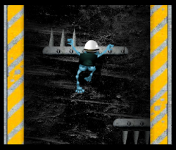 I know I know. You hate the Crazy Frog. Yep, so do I, but work is work. Besides, I did my level best to inject as little evil as possible into this banner game! In fact, it actually ended up a fairly decent little game for what was just a day or so’s work.

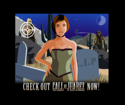 Use your mouse to shoot the baddies and avoid the maidens in this minigame promoting the Call of Juarez computer game.
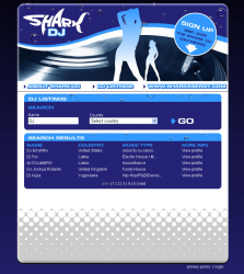 A simple database site for the Shark energy drink. You can register as a DJ and people needing DJ’s can find you!
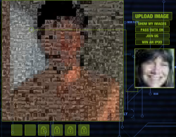 This microsite was produced to promote the film ‘A Scanner Darkly’. As more people upload their images to the system, an overall image begins to form from the mosaic of smaller photos.
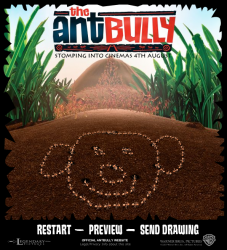 This webtoy was built to promote the Ant Bully film. You get to draw on the ground with a stick, then send your picture to a friend, where it is recreated via the medium of crawling ants!
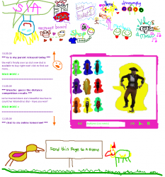 I created this band site for the singer Sia. Her unusual artistic style was brought into the site by making everything look like a 3 year old child drew it!
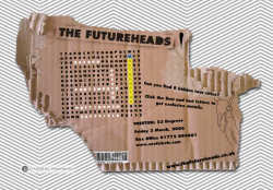 I created this wordsearch to help the band The Futureheads promote their latest tour. Find the tour locations in the wordsearch to get the details.
 RSS 2.0 full site