Posts Tagged ‘postmortem’

Star Wars: Clones V Droids

Wednesday, November 26th, 2008

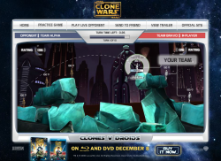
clones-v-droidsYou have just 30 seconds to anticipate your opponent’s thoughts, give your troops orders and move them into position in this multiplayer ballistic fighting game. Then everyone opens fire, and another turn starts.

UPDATE! On playing this recently it seems to have been updated by someone, and broken in the process. The game now crashes often when you’re walking around, which never used to happen. What a shame.

Postmortem:

I could hardly believe it! Not only were we doing a game for the giant Star Wars Clone Wars franchise, but we’d pursuaded them to try something risky and unusual too! A custom-made ultra-light PHP back end would join random players together in an almost anonymous way over the internet so that they could battle each other rather than some shonky AI.

Not only that, but it worked too! In a little over a week, I’d built the game engine and back end and proven the concept. Then the public was unleashed on it. The server coped admirably with the strain of thousands of people playing it over and over. Success!

It could have been better, of course. Just about all things can be improved. In this game, I’d have liked to have spent a little longer getting a few of the interface details working smoother. It’s fiddly to set up shots, which is an area that could do with as little interface-friction as possible. That aside though, I’d really like to have improved the multiplayer features.

I designed the game to put a game together for every two visitors to the site. You get paired off with the next random that comes along, and you’re playing. Minimum fuss, minimum barrier to entry. My experience with lots of multiplayer games is that you get to a daunting room full of 11yo kids who are just waiting for a newbie to kick about the place. I specifically designed against that effect here by removing the ability to pick your opponent, or play them again, or even to know who they are. All you get is a rank – a single number to hint at whether they’ve played before, and whether they were any good or not.

This really works – people dive in and play in generally fair games, which is great. It also means we never have to store user accounts on the server, which is also great. Each player keeps their rank in their shared-object, and it is exchanged at the start of the game. At the end of the game, each player calculates their new rank based on the Elo chess ranking system, and stores it away for next time. Yeah, you could fiddle the number and cheat, but really, who cares? There’s no leaderboard, and no way to shout out how great you are, so there’s very little incentive to cheat. That’s the best cheat-protection system I’ve ever come across!

The downside is that whilst it’s addictive for a while, it won’t hold people for a great length of time. After a while you get bored of there being no further progression. Of not being able to chat with your opponent and of not being able to have a rematch if it was a great game. These features I’d add in another similar game.

I’d give the players a chat box, that they could use at any point especially including whilst waiting for the server to sync up and exchange the moves. I’d also add a ‘play this person again’ checkbox that appears mid-game, so if you both clicked it and left it selected, it’d arrange your next match against each other. I’d also consider an optional match-up room of some sort, so you could meet up with friends. I’d definitely let you enter a name for yourself and exchange that with the other player, so you had some idea who you were playing. Maybe allow a pictorial avatar too. And some sort of earned rankings beyond a simple number. Maybe a veteran’s medal after 10 games, a high-roller medal after they hit a rank of 1600 and so on. You could even allow different things in-game based on what they had earned. Maybe veterans get the ability to pick their fights more carefully. Perhaps high ranked people get access to new weapons when playing against other high ranked people. Giving the player some sort of progression, something to work towards, would go a long way.

Lessons:

  • Multiplayer immediately adds depth to almost any game
  • People love playing against people, even if they’re unidentified randoms
  • Provide a way for people to communicate in-game
  • Provide a way for people to arrange battles with people they know, if they want
  • Provide a way for people to give themselves an identity of sorts in your game
  • Provide some sort of progression for the player to work towards, over multiple games
  • Removing incentives to cheat is far more effective than building technological safeguards against cheating

Hanna in a Choppa

Wednesday, November 5th, 2008

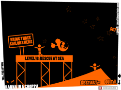
hanna-in-a-choppaCan you help Hanna pilot her chopper through 21 unique and puzzling levels? Use keyboard or mouse controls and fly your way to success.

Play Hanna in a Choppa

Postmortem:

For this game, I didn’t have any external clients. I didn’t have any final goal for it. I didn’t really have much of an initial goal for it. It evolved from almost nothing into something pretty special, almost by itself.

Hanna in a Choppa started life as Hanna on a Hoppa, which was going to be a physics game based on the latest version of my now fairly advanced AS2 physics engine. I’d just given it nice stable flat surfaces to bounce masses off, and they worked an absolute treat. I thought it would be hilariously funny if you played a sort of springy ragdoll called Hanna sat atop a space hopper, bouncing around off all sorts of surfaces and generally causing mayhem. I built the prototype in a short space of time, and discovered that it sucked. Bad. It turns out that space hoppers and physics games go together considerably less well than you might imagine. After fiddling with it for a while, I shelved the idea.

Later, whilst mulling over the name, I thought it’d be amusing to extend the punnage of the Hoppa into all sorts of other things. Hanna in a Choppa seemed like a good one, and I almost immediately had an idea of how to code up the helicopter in the physics engine. I threw a prototype together, and lo and behold it worked a treat.

Initially, the helicopter controls were inspired by an old Amiga game, Zeewolf. That had such an amazing feel to it, I wanted to do something similar, but in 2D. My controls worked and were mightily tactile, but suffered from the mouse wandering off-screen a bit. This is a virtually unsolvable issue in Flash, as you can’t constrain the mouse, but I could at least detect it and auto-pause the game, so it didn’t cause you to crash.

So on I went. I picked a simple in-your-face 2-tone graphical  style mainly because I’m not great at drawing, but partly because it would perform superbly. And partly because it would hide overlapping object errors in the physics! From the cartoonish over the top style came the cartoonish over the top captions and level designs. The project grew and grew until about half the levels were done, and it had enough interface screens to show around to some friends for a bit of playtesting.

Disaster.

Nobody could get the hang of the controls. The beautiful tactile controls that I adored so much, and that I could fly with such finesse. All I wanted was to give that experience of harmony to the world, but nobody got it. Nobody understood. Everyone who tried, ended up stuck upside down in any nook or cranny.

I tweaked those controls. I added sensitivity settings, subtle self-righting, clever damping, non-linear response curves, all sorts. They all damaged the experience for me, and none helped for other people. I caved in and added key controls that drove the same force vectors that the mouse was attached to.

This was better. People could at least fly for a while now. For a while. Without any finesse, and bumping off walls a lot. On the plus side, now people were playing for long enough to appreciate the level design a little more. The fact that you could pick items up with a winch, push them around etc. The way each level presented a different challenge and task, not just a harder set of obsticles to fly through.

But it still wasn’t good enough. People got frustrated and still gave up quickly.

I caved a second time and added the key controls that you can play in-game today. You push right. The chopper flies right. You push up. It goes up. And so on. Finally it was accessable and everyone could play it. I didn’t like the idea of losing the mouse controls though, so kept them in and put the easier keys on an option.

An option that nobody played long enough to find.

So I added a new screen at the start of the game. New players were asked to make one choice – easy key controls, or hard mouse controls. A lot of people selected easy at this point and went on to have a lovely time. A significant number picked hard however, and within 30 seconds of gameplay hated the game. The curious thing here is that they never went into options at this point and changed back to easy. They just quit and went elsewhere.

So eventually, after a little bit of alone-time sobbing, I made the key controls the default. Most players would never go into the options menu and would never even try the trickier mouse option. It was the right choice. For certain. I haven’t read a single comment on the web from someone saying they enjoyed the mouse controls. A few people have commented on how tough it is on the mouse though, but they’ve already played the game enough on keys to not hate it.

Anyway, the game was now more or less complete. A few more levels remained to be built, and a couple of interface screens needed a bit of polish. Next came the love.

I’d been deliberately building love into Hanna in a Choppa as I went along. Little humorous comments and references in the levels seemed to go a long way with the playtesters, so I made sure they were all as amusing as possible. I ensured there was plenty of diversity in the levels, rather than increasing difficulty. That worked a treat too. People would keep playing to see what madness they had to perform next, rather than to improve at the game.

Adding the love was all about increasing the number of those little features that make people smile. So, for the hardcore gamers I added achievements. They announce themselves visibly when you get them, and you’re more or less bound to get a few by accident along the way as some of them are pretty easy (on purpose). Then, when you’ve completed all the levels and are hungry for more, you remember the achievements and hunt around for the screen that shows you what else is available to collect. I made some of them dead easy. Some flippant and silly, and some rock solid hard (like perfecting all levels – flying without touching the walls at all). This meant that people could play to whatever level they fancied. The elite gamers could get everything. Mid-range players could get a fair chunk but miss a few, and amateurs could drop out after beating all the levels. It’s a sort of self-adjusting difficulty curve in a way.

Then there was things like the developer message screen. I find feedback and stats unbelievably useful to get to know how a typical gamer thinks and reacts to things. If I ask for feedback, I know I’ll get a lot of rubbish, but there will be a few gems in there that’ll really teach me something. In Hanna, I made it an achievement to send me a message. Well, gosh, I got a lot of messages! And still get a lot of messages. That’s fine though, and there have indeed been some gems.

The “never press” button was well received too. I thought when I made it that about half the players would like it, thinking it cute, and the other half would think it entirely pointless and rant about it. Not so. Everyone who commented loved it, or apologised for making it cry. It seems people really do like sillyness for sillyness’s sake.

The rich feedback let me summarise the main criticisms against the game. I’ll respond here…

  • It’s a bit slow on my old PC: Yep, fair comment. The physics engine is fairly heavy, and does a lot of mathematics. AS2 isn’t great at this (AS3 is considerably better of course, but I don’t work with it yet). A fairly modern machine should make a sensible framerate, but if it chugs on yours, sorry.
  • There’s no quality settings: I know. That’s because a low quality mode wouldn’t help performance. In most Flash games, rendering all the pretty effects slows down your computer. Hanna has very few pretty effects, but does do lots of codey maths. The Flash quality settings just change things antialiasing, which for Hanna it can do in its sleep.
  • The wench is a bit fidgety: Here’s a dictionary. Work out what you just said to me, then I’ll talk to you.
  • Oh. The winch is a bit fidgety: Ah I see what you mean now. Yes, it is. Sorry. I should have done something about it really, but the physics engine isn’t really up to doing short bits of rope. It’s a totally fair comment.
  • Level 8 is hard to perfect: It is on the crappy key controls, yes. If you learn the mouse like a responsible gamer should, you just flip upside down and throttle towards the fan in complete control. I suppose you’re right though, given all the stuff I wrote about above.
  • Level 19 is hard to perfect: Yep, my fault again. On the mouse it’s a bit easier, but I know you don’t want to hear that. I should have made the survival space a bit bigger really, but that would have added three more physics surfaces to a level that’s already doing rather too much for ideal performance. Compromises were made.
  • Level 20 is impossible: Really? Are you sure? Because I can do it pretty easily. You did remember your chopper has a wench winch installed, right? I mean, you have only been using it for 19 straight levels, so I see how it might slip your mind…
  • All that orange hurts my eyes: Fair comment, hope I haven’t done you any permanant damage.
  • There’s no end of game reward: Actually, there is, but only when you get all the achievements. To be fair you’re right though, I should have added something a little special for when you beat every level. My mistake. Again.
  • Forcing me to write to you is lame: Hey, I wrote you a game for free that entertained you for about an hour! Can’t you write even a couple of kind words back? Bloody ingrates.
  • Can you tell me how to make games? I’m just starting out but I’m 95% done making this amazing RPG but I can’t figure out gotoAndStop: Might I suggest the F1 key in Flash?
  • this game suxxors u suck worst gaim evur 1/1000000000!!!!!!1: Learn to spell, learn to punctuate, learn some respect, create something worthwhile yourself, then we can talk. Thanks.

Lessons:

  • Give creative things room to breathe
  • Don’t get attached to any aspect of your game. If playtesters say a feature sucks, rip it out and put something better in. Just imagine multiplying ‘it sucks’ by all the people who will play your game. That’s a lot of suckage!
  • Anything that turns a player off in the first 30 seconds will ruin your game’s play figures
  • People don’t read instructions
  • That one tiny piece of level design that isn’t quite right yet – FIX IT! Fix it or else. Fix it, or people will moan at you forever more about it
  • Inject love into every corner of your creations. It pays back a thousandfold
  • If you make it an achievement to send you a message, be prepared for hundreds of thousands of messages!
  • Take the time to make the sound-stage work well
  • A surprising number of people don’t know the syntactic difference between a winch, a wench and a wrench! My inbox is pretty comical at times

Skulduggery Quest

Friday, August 22nd, 2008


skulduggery-2Register to play the quest, then use cursor keys to walk around and the mouse in mini-games.

Postmortem:

The game consists of four main chunks, tied together into a quest:

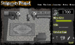
Hub: Walk around in a vaguely Zelda-like fashion, exploring and picking stuff up. This is intended as a sort of story-led role-playing-game section that takes you through the other mini games.

Spot the difference: Just the basic spot the difference game transferred to a computer. You get a different puzzle made up each time so it doesn’t become completely trivial to solve if you replay.
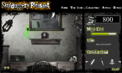
skulduggery-1Magic Levitation: A physicsy lift ’em up. Not sure I’ve played anything quite like it before – you have a magical levitation ability that you have to train up until you can chuck the item you need out of the window.
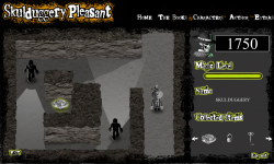
skulduggery-3Cave Exploration: A bit like the old Amiga game Commandos. You have to find the final important game item whilst evading the sight of the guards.

Individually, each mini game is amusing for a bit. The big problem with the game as a whole however is the lack of cohesion. I think this stemmed from a lack of adequate planning in the early stages, leading to a fair bit of making-it-up-as-we-go as the deadline encroached. What we ended up with was a nice enough game engine for an RPG, but with no strong story or other characters to interact with. For a story driven game, having no story sounds like a bit of a deal breaker to me. And if there were a story, having no characters also sounds like a problem!

There’s some neat code running under some of this, despite the lackadaisical gameplay experience.

Hub: Whilst walking around, you can pass both in front and behind most objects. I came up with a method to do this that doesn’t require constantly swapping the depths of everything. There are two copies of the clip that contains all the scenery objects positioned directly at the same spot on screen, with your character sandwiched between them. Each item’s position on screen is compared to the characters. If it is above the character then the back version is set to visible and the front invisible. If below, the other way round. Flash’s _visible property works internally by simply skipping the object when rendering to screen, so its very efficient this way.

I wouldn’t recommend you build a similar system however! There’s a downside (isn’t there always). Whilst it works really fast and reliably with one moving object, if you add any more you can’t guarantee that its possible to sort things still!

Levitation: I’ve been developing a lightweight springs and masses engine for a while now. It was last in use on the Rant game, and before that to do a string effect on Paul Steel’s site. Each iteration the springs get more stable, the masses collide more realistically and the efficiency of the engine improves.

The physics engine grew a couple of features for this game. Attractor and repulsor masses for a start (to do the actual levitation bit). The game worked beautifully with an attractor mass – it was like trying to pick things up with a weak magnetic ball. It wasn’t all that easy to play however so I made it a repulsor following the mouse position instead, and got a lovely floaty feel.

The collision engine got an overhaul too. It now has a concept of collision sets. This is a way of tagging a mass such that it knows not to check for certain types of collision that can’t happen, or even that we don’t want to compute to help the game effects. There’s another major performance enhancement gained from sorting all the masses along the x-axis. The sort routine is built into Flash’s runtime engine and hence almost free in terms of execution time. Most of the Flash built in stuff runs really well, but as soon as you try and do something complex and algorithmic in ActionScript (version 2 and below that is) the inherent sloth of the language’s dynamic style means everything grinds to a halt. Anyhow, after the x-axis sorting, masses are only compared until one is found on an x-position that cannot collide no matter what. This runs in both directions from the mass in question and the search is culled beyond the discovered limits. This gives an impressive performance boost overall, at the expense of a small amount of fidgetyness of masses as they settle (if they sort into a different order after a small movement, they get itterated in a different order for collision responses, which can give a different outcome response).

I’ve made pretty heavy use of Flash 8’s new-ish bitmap processing for graphical effects. Push the light around with your magic, and watch the shadows. Its a subtle effect but the shadows move around depending where the light is coming from. Shadows get longer, fainter and adjust their position all in realtime. This is all done using the new drop-shadow filter on each of the graphical objects in the scene, and a bit of trivial trigonometry. A simple effect, but powerful, and I haven’t seen anyone else doing it yet.

The graphical effect of the magic itself is scripted too, rather than an animation. Particles of magic are placed onto a bitmap each frame, then the bitmap is faded and colour transformed via yet more filter effects. Over multiple frames, moving things leave trails across the screen. Pretty.

Caves: The base engine for the caves section is identical to the hub. I can hear what you’re thinking (if you’re still awake). You’re asking how it can have NPCs wondering around when the system can only cope with depth sorting against one moving object. You weren’t asking that? Well you’re getting the answer anyway.

The NPCs follow a set path. They are at a set depth with respect to the walls etc, and are duplicated in the same way (in fact, they’re just objects in the world like any other). If you pick their path and depth in the scene carefully, you can engineer it so that they don’t look wrong. It just means you can’t have an NPC wander about freely as they can’t walk both behind and in front of an object without causing odd glitches. On the final screen the baddies do laps of an island-wall, which seems to break the engine’s rules again. The trick is that the baddies don’t actually go behind the wall at the top – they just stay above it a little. Look carefully and you might see their shadows glint above the wall rather than behind it.

Visual line of sight ‘vision cones’ were a challenge too. It isn’t all that hard check if a particular point on screen is in sight of another particular point. You just cast a ray between them and see if you hit anything that blocks sight along the way. Or if you have the walls in vector form you can check for collisions mathematically with a line intersection check.

To show a cone of vision however, you have to run the above check for every pixel that might be in sight. That’s generally a hulluvalotta pixels, and infeasible for realtime Flash games.

I’m fairly proud of the technique I invented to get sufficient performance here. I first cast a shadow off the back of each of the wall segments to the edge of the screen. This is done by simply projecting the end points of each segment out plenty of distance and joining the dots. This polygon is then drawn to a memory bitmap with the drawing API and clipped to the visible area. Flash is superb at doing this sort of manipulation as long as the shapes are simple, so there’s only a minimal performance cost here.

Once the shadow of every wall is drawn (as if the enemy in question is a light source), we have a set of pixels that the baddie cannot see. A little bitmap magic to invert this, and we have a mask we can apply to its vision cone drawn complete. Job done – our baddie can’t see through walls anymore.

One nice bonus with this technique is that we get almost free line of sight tests between the baddie and any point on screen. First do a hitTest against the complete vision cone shape. If the test succeeds, do a pixel colour lookup on the mask bitmap at the appropriate point. If that point is within a shadow, we’re out of sight. If not, we’re visible. HitTest and getPixel32 are both lightening fast.

This technique has a few unavoidable downsides. Firstly it uses two large bitmaps for every baddie. This means lots of memory allocation (bad for old machines) and lots of pixel setting (bad for any machine in Flash). Its setting all these pixels every frame that costs most of the time in this routine, even though those pixels aren’t used directly on screen. There is also some kind of bug in the Flash player that leads to rapid memory leakage. Switch screens and you lose a meg or two of memory as the new baddies are generated. You also lose a smaller amount each frame. I eventually traced the leakage to a line that reads;

clip.cacheAsBitmap = true;

Without the line, no memory goes missing. With the line, megs per screen. Doesn’t seem to matter if you turn the caching off later, you still lose the memory. This is something that the Flash player is meant to entirely manage internally, rather than it being the programmer’s responsibility. The same behavior exists on the Mac player too, curiously.

Final lesson learned: On the PC Flash player, Key.isDown(1) is a fine way to read if the left mouse is pressed. Its a fine way to find out nothing at all on the Mac. That’s the first really significant difference I’ve found cross-platform with Flash. A testament to just how well the player is built and tested!
Rise of the Silver Surfer

Tuesday, July 8th, 2008

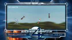
silver-surfer-1Use the mouse to dodge incoming missiles in this fast paced side scrolling action game. How long can you last?
Postmortem:

Behind this basic looking game lies a well tuned piece of gameplay. Anyone can pick this game up in seconds and it feels good to float about on a flying surfboard, but mastery is a tricky task. At it’s heart, there’s just one task – dodge missiles. And only two types of missile too – straight ones and seeking ones. Behind the scenes though there’s a subtle level progression that takes you through some 15 or so different stages of types of attacks. From one at a time, through waves of attacks, to an endless onslaught. You can really get into a rythem of dodging and it feels great when you get into that flow state, diving one way or another almost omnisciently.

The game played awful for a while due to not being able to see/anticipate where the next missile was coming from before it was on top of you. The addition of arrows at the edges that grew as the missiles got closer helped a lot, then the final touch of a launch sound that subtly prompts the player to look out for a new arrow finalised the gameplay feel.

The motion of the Surfer himself mattered a lot too. He needs to be flingable, but also controllable. To move fast when needed, but also to have precise control when required. This is achieved with a fairly complex system of accelerating towards the mouse faster the further away he is, and progressively more damping the closer to the mouse he gets so he doesn’t overshoot and oscillate wildly.

The game looks like a sideways scroller, whizzing over trees at a tremendous rate. The background scroll is a simple looping tween however, and all the gameplay is static on top. Even when I tell myself this whilst playing, it’s a powerful enough illusion to give me a real sense of speed.

One of the few issues I have with the game is that it only becomes really fun for the player when they are challenged to their skill level. When you’re learning to play, the game ramps up appropriately, but when you’ve played a few times already, you have to wade through the early easy levels to get to the fun bits. There wasn’t much scope for changing this in the project, but if I were to revisit this game I’d think up something to let you play on from where you were before.

Lessons:

  • Simple games can be great fun if they feel just right
  • Shortcuts can often work where a ‘proper’ solution would take longer and give very little tangible benifit

Tide Dawn Stainscrubbers

Sunday, May 25th, 2008

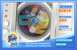
tide-dawn-stainscrubbersUse your mouse to control the main bubble and erase stains in this washing machine clean ’em up. Grab the bonusses for a powerful boost in cleaning power.
Postmortem:

The original concept for this game started out as a fun sounding idea. You were a bubble, inside a washing machine. You’d naturally cling to the edges, but could leap out into the spinning drum where you’d clean anything you passed over in your jump. The jump would be affected by the tides, centrifugal force and so on.

After prototyping this, the client didn’t like it. It wasn’t a bad game, but it was pretty hard to pick up at first. We offered to make it easier (it was just a prototype after all), but they instead wanted a completely different gameplay mechanic. Their suggestion was close to what you now see.

I built the new mechanic, and discovered it was dull! Boredom isn’t a good basis for a game, so I set it up to be pretty short on the theory that players might stand a chance of getting to the end. Also, the game has few special tricks (basically, slow mode, fast mode and bonus mode), so I spread these densely across three levels so that the player would constantly have something new happening, if only for a short period of time. It wasn’t an awful game at this point, but wasn’t great either. Most people who playtested it at least got to the end which was the point, as that’s where the datacapture and competition elements came into it at that time.

The client liked this version more, but wanted the experience to last longer. Much longer. At their request, we extended the game to ten levels each as long as the previous, with a chance to drop out at any point if you failed to clean the super-stain or collect one of the boost bonusses. Now, not even the in-house quality testers would play to the end. For a couple of levels it was interesting, but after that it was just repetitive and dull.

The client liked this version lots, and that’s what you see today!

Lessons:

  • Sometimes, a client’s demands will simply wreck your project! You can try to direct them towards a better solution, but you need to be prepared to back down and let them break it if that’s what they really want
  • Don’t get too attached to your creation if you have any form of external client to answer to!
  • Repeated itteration doesn’t always lead to a better game
  • It’s not advisable to stick too closely to the product’s concept in an advergame. Often it’s better to make a good game, and find a way to shoehorn the product into it rather than the other way round.
  • Games MUST be fun!

Zotti-Motti

Tuesday, May 13th, 2008

zotti-motti-roomZotti-Motti is the mascot for the Austrian Stadhalle building. I created multiple elements for the website.

Postmortem:

Main room: The hub from where you can navigate to the rest of the site. Click the TV console screen for the platform game, the cards on the bed for the pairs game, the radio for the karaoke and other elements for more stuff like galleries and stories (not generally built by me). Don’t miss stroking Zotti-Motti’s fur with the mouse, and playing with all his dangling toys too. My AS2 physics engine works hard here to create these effects. There are a number of other easter eggs in this room for the observent and inquisitive to find.

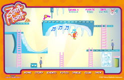
zotti-motti-gamePlatform game: Use cursor keys to guide Zotti-Motti through this platform-puzzle game. There are only six levels, but each one is carefully crafted to have unique puzzles and items to solve. The idea was to make the player think around the cartoon physics of the game and use the objects they find to help progress.

I’m really pleased with the way the puzzles in this game turned out. Every level presents something you haven’t seen before, which forces you to keep thinking throughout the game, but doesn’t force a steep difficulty curve on you. A lot of games just get harder, faster and require more skill as you progress. This one forces you to rethink each level, but once you have worked out the solution you should be able to achieve it fairly easily.

I’m also pleased with the way the hint system worked out. If Zotti-Motti gets to an area where he needs an object, he either has it and uses it automatically, or he hasn’t got it and a thought-bubble appears with him pictorially imagining it. For example, he thinks about the ice-skates at the top of the ramp in the picture. If you go on the slope without them, he falls over, doesn’t make the jump and laughs at himself. If you do have the skates, he leaps across and taps the icicles playing a randomly picked tune. The tune opens the door at the top, but the door shuts too fast for you to get there. The idea is that you have to remember the tune then re-play it on the icicles near the door in order to open it (this is as hard as the puzzles get in this game). I tried to think up unusual and imaginative puzzles like that as often as possible, and largely succeeded I think. Each one gives the player a little rewarding pat on the back as it is solved, which helps keep their interest up and makes them feel clever and special for having worked it out. This goes back to my core principle that games should be fun, not difficult. It’s fun to solve puzzles, but it isn’t fun to be beaten up by them. It’s fun to slide down ramps and jump ravines, but it’s not fun if it requires an immense amount of skill to perform.

The platform engine technically took an unusual path in this game. Zotti is a series of square movieclips underneath, as are all the things that can be walked into or stood on. Each square is tested for collisions with Flash’s AABB collision test system; MovieClip.hitTest(clip), which is wonderfully fast compared to testing points against shapes. This also means we can have very free-form levels that aren’t constrained to a grid, and positions can be tuned to the nearest pixel without extra work. Bounding boxes are also pretty big compared to points, and tunnelling through objects becomes a much smaller issue with this technique. All this makes for a considerably more robust platforming experience, even when Zotti-Motti is moving fast with the high-jump ability, or the rollerskates. Robustness is essential in platformers! As soon as the player glitches through a platform, or gets killed by a static wall etc, they’re going to go right off your game.

Baddies in this game are very simple timeline tweens back and fourth over the same area. Their motion is detected and they are set to their idle or walk cycle animations as appropriate.  This works really well as the baddies don’t ever have to react to the player or deviate from their path. It lets you design their actions right there in the Flash IDE where you can see them in place right away.

That’s another principle I developed more on this game. Level design in the Flash IDE. Before, I’ve often had arrays of data that levels are created from, with assets in the library and so on. This works, but is hard work as a development cycle as it is an inherrently non-visual process. It’s led to a few games having too few levels to do them justice too, which is a shame. Far better is to build interractive clips that you can position directly on stage to build up the levels, with all the magic associated with them at runtime automatically. That way, the Flash IDE itself becomes your level design tool, and you get all the power of the editing and animation tools to play with as you go, hopefully leading to better looking and better playing level design.

Lessons:

  • Try to introduce new concepts for the player to tackle each level, rather than just ramping up the difficulty level
  • Building level design tools directly into the Flash IDE is a great idea
  • AABB collisions are a great tool in the right circumstances
  • Everyone loves a cute pink fluffy monster

zotti-motti-pairsPairs game: Nothing too special here. Just the traditional matching pairs game that appears everywhere on the web. This version was based on the Sonic Rush Adventure game I built previously, so you can turn cards over as fast as you like and it keeps track nicely. You also get a little bit of sound when you match a couple of instruments too. It’s a nice little game, but won’t hold your attention for long.
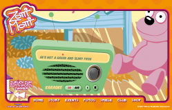
zotti-motti-karaokeKaraoke: The client wanted the Zotti-Motti song to be played on the radio in the room. Easy enough of course. Then they wanted the lyrics to display in time with the music – a little harder. Then they wanted a bouncing ball to run along with the words and syllables, all in perfect time too. Now we’re into the realm of a technical challenge!
I started this the old fashioned hard way, with a sound editor. I added markers manually at each syllable by playing and pausing the sound, and transcribed them into the code to be used as times. It was a horribly slow, error-prone and dull process, and the results were rubbish anyway. I gave up a couple of lines into the song.

The solution was to build a tiny app that played the song and listened for mouse presses. Each time the mouse was pressed, Flash got the millisecond position from the sound object and traced it in the output window. Then, all I had to do was listen along with the song and click along in time with the words – something the human brain is a lot better at than treating each word separately in a sound editor. The times were copied into the code’s data and the results were horrible.

Turns out I don’t have any rhythm.

Luckily, one of the other coders in the office was a musician, and tapped out the timings considerably better, the results of which you can see in the song. If you can stand to listen to the cheesy horror!

Actually, I rather like the girl’s voice in the song. Shame about the male voice. And the song itself!

Lessons:

  • If it feels like you’re doing it the hard way, you are. Rethink your approach
  • Building a very quick rough tool is often faster than tackling the job with the wrong tools (incidentily, this goes for car maintenence and DIY too)

Chronicles of Narnia: Reepicheep Run

Monday, May 12th, 2008

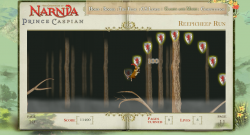
reepicheep-run-gameUse the mouse to control Reepicheep the heroic mouse in this tricky skill game. Click somewhere above Reepicheep to make him leap towards the mouse. In the air, move the mouse in-front or behind him to apply aftertouch to your jump’s path.
Collect powerups to jump further, have more control in the air and gain extra lives.

Postmortem:

This game is one I rather like personally. It’s got on of my favorite things in a computer game – a tactile main character. By that I mean you have a certain subtlty and finesse in the character’s control that rewards patient learning and practice.

Unfortunately, these things are exactly what web-game players typically don’t want to do. They want to leap straight in and be acceptably good at the game, not to fall off every branch with no idea what they’re doing wrong.  If a random web player can’t get into the game straight away, they’ll almost certainly go elsewhere. There’s no shortage of other games out there to play.

A second issue caused trouble with this game too. Compounding the fact that it’s a pretty tough game was the fact that the client kept wanting more difficulty added to it. First it was extended to be considerably longer (which wasn’t a bad thing). Next they wanted to speed the auto-scroll up as time went by (which makes it become very high pressure towards the end). Then they wanted fewer lives and fewer life power-ups (I was generous with them as it’s so easy to die). Then they asked us to add branches that break if you sit on them too long (adding even more pressure and no chance for a breather). Eventually they wanted arrows shooting through the branches at random, which we made a stand against since you have very little chance to avoid them. It’s a game about planning your next move, rather than reacting. Once you’re in the air, you can only make fairly small adjustments. In no way could you dodge fast moving arrows!

Finally, when we discovered that lots of people couldn’t get the hang of jumping, we asked the client if we could build a jump preview line that showed the rough path of the jump before you clicked. They were heavily against this idea, dispite my thinking it would help considerably with getting new players to a competent standard rapidly.

Dispite the added difficulty, I still like this game and still enjoy playing it, which is unusual for games I’ve worked closely on. Usually you play a game to death during its development, and are happy not to see it again afterwards. Not so with this one. I still come back to it from time to time to see if I can still perfect those jumps.

The character’s movement comprises a few subtle elements. Firstly, the mouse takes his initial jump direction from the angle to the cursor. His jump force is calculated from the distance, so you can do small adjusting hops, nimble jumps to a nearby branch, or huge leaps across the screen. Then, the spring motion of the branch is added onto that initial force, so you can time your jump with the release of the energy in the branch to go higher or further, or the opposite – and do a minimal jump. You can leap up through branches then land on them, or leap down through branches to a lower level and add energy to your next jump. In mid-air, there’s an affect of aftertouch where Reepicheep has a slight acceleration towards the mouse cursor, so you can bend and curve his jump after you’ve taken off. You can power up all these abilities too, with the pickups strewn around. Finally, if you get to the right hand edge of the screen you can push-scroll the level, so it’s even possible to speedrun the game!

Collision detection was an issue in build. Branches are necessarily thin things, and the character moves necessarily fast! Tunneling through branches is simply unacceptable in this case as you’re depending on hitting them for survival throughout the game. The solution was to scan every pixel between Reepicheep’s previous position and his next, and test each for collision with the branches so that you collide with even the thinnest hint of a branch. To keep everything running well, the forrest is divided into lots of short segments, each is attached to the stage just before it is needed, scrolled through view then removed as it goes out of sight. Only branches in the current segment are tested for collisions of course. New segments are attached automatically when required, and each segment contains power ups right there on the timeline as required. A discovery algorithm runs searches through instance names at runtime as segments are attached, learning what items exist and setting them up as appropriate. This works really well, and far better than having metadata in the code that has to be kept in sync with what’s on stage, or worse, coordinates for powerups stored in the code. It’s just so much easier to adjust – you just chuck a new powerup on stage from the library, and give it an appropriate instance name. Recompile and it’s there in the game, functioning.

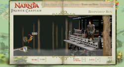
reepicheep-run-endThe final part of the forrest contains a large treehouse that you make one final heroic leap to, then squeak your important message to Prince Caspian directly. Granted, not many people are going to get this far as it’s a pretty tough game, but those that do should at least feel like there’s a proper conclusion, a bit of a point to it all. As a game developer it’s easy to overlook how important this is as it really adds nothing to the gameplay mechanic at all. It’s just a big bitmap and some special case coding at the end, rather than a different challenge etc. It’s hard to justify why we’d want to build it, but the feeling of closure and reward for the player is immesurably important.
Lessons:

  • Tricky yet rich control mechanisms aren’t generally a good idea. Extensive user training is required, which most people won’t bother to work through
  • A proper end goal is a great way to finish a game. Just cutting at a given point really isn’t! This one does it well, with the final treehouse with Prince Caspian being a really solid final point
  • The Flash IDE is still a great level design tool

Speed Racer Chaser

Friday, April 25th, 2008

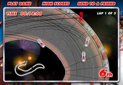
speedracerUse cursor keys to drive in this high-speed racing game. Hit spacebar to deploy your car’s weapon, and shift to launch into the air. Can you beat all the other players, which are recordings of other real human drivers?
Postmortem:

Ah, a chance to do a pure arcade racing game, with actual racing cars rather than trollies or reindeer or airport baggage karts! Brilliant. I was determined to make a really good Flash racing game, with arcade but partially realistic handling, fun tracks, weapons and a little bit of a multiplayer twist.

AI in racing games is hard. Even the big name consold games don’t get it right, and have either unrealistically good AI drivers or comically bad ones. In a lot of games, the computer AI just bulldozes through your car sticking to its pre-programmed lines like a limpet. It feels unfair, and it’s not good enough! Rather than build a crappy AI for this game, I came up with the idea of recording people’s gameplay whilst they were racing and storing them on the server (stored by their starting position and overall performance). Then, when a new game is started, the server puts you in a random grid position and sends out 8 replays – one from each remaining grid slot. They are picked at random, but in a skewed way so that you play against a mix of the best, worst and mediocre players out there. That’s self-ballancing – the range of opponents you meet is determined by the actual range of skills out there, from good to bad. There is a par time over which your score isn’t recorded to avoid skewing the results towards people who just leave the game running forever, but other than that it’s a level playing field. This strategy really worked for this game, and everyone gets opponents who play roughly at their level – and some who are faster that they can work towards beating.

The big problem with storing and serving replays is that there’s a lot of data. AS2 doesn’t handle binary data very well except in pre-given formats that are delt with internally like jpegs, sounds or SWFs. So, a replay consists of a great long string of car coordinates etc in a text format. There’s very little encoding, as I found that simply processing the raw strings was enough of a task for Flash, let alone processing an encoding on top of that. I’d have liked to have compressed the strings, or base-64 encoded them or similar, but it just wasn’t feasable. The remaining problem was that each play of the game required about a 1mb download of replay data from the server, which was very bad for bandwidth when the number of plays started to climb dramatically. We had to trim back the number of replays sent to the client to just 4, then 2, then none as the load increased. The URL presented here allows you to have all 8 opponents switched on, as it’s going to be pretty low-load from this website.

Car handling was a major area of improvement in this game over previous racers I’ve built. The cars have a single giant virtual tyre that they run on, which resists sideways motion and promotes forwards motion. When the car turns, this virtual tyre turns with it, causing the car to grip and change direction. This is reasonably analogous to the way a real car turns in many ways, and leads to a decent feel. Rather than programming in effects like sliding if you turn too fast, or if you land a jump facing sideways to the direction of travel, it just naturally falls out of the physics model. Likewise, slow speed turning works better this way too. The model is also very tunable to different car styles, so some are fast but have little grip, some have too much grip and are hard to control, some are ballanced and so on. There is no ‘best’ car, although there tends to be a couple per track that people end up using predominantly over the others.

A big part of the Speed Racer film was the twisting looping jumping corkscrewing tracks. In a 2D game you’re limited to how far you can recreate these effects, but the tracks certainly do have these stunts in them, which is a nice effect. Even better, you can short-cut them in cunning ways using your car’s jump ability, which adds a little depth.

Another requirement from the film is the use of car-to-car weapons. This poses a problem with the replay technology, as a replay is by its nature an asynchronous event. It does not contain data saying how the human player reacted to being hit by a weapon at any random point. The simple rules I adopted were to never fire weapons at the human player (ie, weapon usage is not recorded in the replays), and if a replay car gets hit, to simply spin it around in a straight line along its direction of travel until it falls off the track edge.

The other thing you can’t do with a replay is car-to-car collisions. You can’t purturb the replay car from its course, as that would put you ‘off’ the replay line with no obvious way to get back on it. You can’t just slow or collide the human player either, since that would get recorded in their replay and when played back to another player, would look strange as they randomly react to a collision that didn’t happen. There was nothing better I could think of than simply allowing cars to overlap. Not completely satisfying, but that’s all I could do.

As cheating features quite heavily in the film races, I’ve deliberately allowed for it in the game. If you use your car’s jump facility carefully, there are a number of places you can take shortcuts by jumping sections of track. It’s risky of course – you stand a fair chance of falling off the track instead of saving time, but that’s good for ballance.

There’s an issue with the pace of the game and some of the cars. If the player picks one of the faster cars, it’s hard to see what’s coming and to keep the car on the track whilst cornering. Falling off track is punishing to your time at least, but doesn’t throw you out of the race because it’s really rather easy to do. If you opt for a slower, more controllable car, you stand less chance of keeping up overall.

Performance is vital in a game like this. Keeping the framerate high was always a priority, right from the beginning. There’s a huge amount of stuff bitmap-cached to aid this. The background is a short loop, scrolled around as required and flipped to the other side of the loop when needed. There are a few layers of it, but each is just a series of bitmap cached effects. The track itself is created from segments at the start of the game. The track exists as metadata in the code, as a simple array of segment IDs. The IDs are itterated as the track is created at the start, and each segment is instantiated into its own movieclip from an end-marker clip in the previous segment, then bitmap-cached. This allows for much bigger tracks, as it neatly gets round the 2880px bitmap limits by having lots of smaller ones instead. It does take a while to produce the track at the start though. This is what’s happening behind the silver “creating track” screen before the race. Without the bitmap caching, the length of time that screen appears for (several seconds on most machines) would happen to be the in-game framerate too!

Generating the track in segments gives me a nice convenient way to tell how far through the track each car is. They are hit-tested against the segment they are in and the next one too, and their position is updated when they are in the ‘next’ segment. If they are over no piece of track, their position is hit-tested against all segments as they may be about to perform a shortcut jump. Whilst in the air however, they are considered to be on the piece of track they last touched. That’s where they get reset to if they crash, and where they are positioned in terms of the race order.

Lessons:

  • Multiply up the bandwidth for a typical gameplay by a best-case number of plays to see if it’ll work with your hosting provision!
  • Add subtle touches for more depth
  • Processing big strings in Flash is horribly inefficient
  • When used right, bitmap caching saves huge amounts of CPU time

Teenage Mutant Ninja Turtles

Wednesday, December 19th, 2007

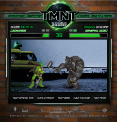
teenage-mutant-ninja-turtlesTake control of your favorite Teenage Mutant Ninja Turtle in this classic beat-em-up. Use cursor keys and C + D to fight increasingly tough stop-motion baddies photographed from the real toys.

Postmortem:

The Street Fighter 2 games and their endless series of sequels have long been favorites of mine. There’s something about the feel and the flow that is just right in those games. Skill really plays a part, which I just haven’t found to be the case in a lot of Street Fighter’s competitors. So, when we decided to build a beat-em-up for the new Turtles movie (which is frighteningly bad by the way, don’t bother watching it if at all possible), I was quite excited.

The timeframe for this game was a little over a week – 6 or 7 days of code work alongside a day or so of photographing the characters in absurd ninja poses. It turned out an illness shot around the office for most of that week too. I don’t get ill a lot, but this particular bug hit me hard and I distinctly remember coding away at the game with my head slumped on the desk just in front of the keyboard, peering up at the screen to see what I’d typed! It’s a minor miracle that the game even got finished, let alone was a half-competent fighting game.

I was determined to get a lot of my favorite parts from the Street Fighter games into this, and for the most part I think, managed it. I wanted all the moves to be different from character to character (achieved). I wanted special moves based on quick performance of key-combos (achieved). I wanted freeform hit-combos against the opposing player (achieved). I wanted the AI player to put up a decent fight (achieved), and to be able to play to the character’s strengths in set-combos (achieved). I wanted it to play fairly, so the computer had its own set of virtual controls that it pressed and clicked just as if it were a human player (achieved).

In fact, that last feature means that with a bit of code hacking, you could play as any character, and the computer could play as any character. You could arrange for computer-Vs-computer battles too, which were fun. That and a high framerate actually made for an excellent character ballancing tool – I ran lots of computer-Vs-computer battles to test out the various pairings, as well as playing lots of the combinations too.

We hit upon the idea to use the real plastic figures, and play the game out as if it were literally a fight between the toys themselves. This works fairly well, but took a lot of work to take the photographs and process them into usable graphics. Also, the range of movement of some of the toys’ limbs left a lot to be desired. The turtles themselves are largely OK, but the baddies are mixed quality at best! The lady fighter in particular looks gangly and strange in a lot of her moves. I’d have liked more animation frames too, but we just didn’t have time to prepare all the extra graphics we’d have needed.

The game was widely played, and received mixed ratings. Lots of people ‘got’ it, saw how it was similar to Street Fighter and enjoyed it. Lots more were used to the more button-bashing type of fighting game, and didn’t like it at all. That’s fair comment really – and represents a failing of the game to lead them into the right techniques and strategies. Perhaps more of a training mode than it ended up with would have been helpful here.

Lessons:

  • Aim high, and you might just hit!
  • Don’t be scared of taking on a daunting challenge if you’re determined enough to see it through
  • You can’t please everyone all the time

Rant

Monday, May 14th, 2007

rantCause the biggest pile-up you can in this quick-hit driving game. Use the cursor keys to race up the road and smash into the junction at the end. The more you hit, the better your score!

Postmortem:

Whilst messing about with an idea I had in my spare time, I ended up creating a basic AS2 physics engine for simulating masses and springs. It turned out to be just what was needed for the Rant game. Each car is two round masses joined together by a spring, with a car graphic pasted over the top. The resulting losenge shape isn’t really much like a car I know, but it is perfectly sufficient for the game as it stands.

Initially, I tried making the cars out of a box made from four masses and six springs holding them in position. This ran considerably slower as the collision detection had that much more work to do, and there were that many more springs to simulate. The results weren’t as good either, with boxes occasionally turning inside out and often wobbling like jelly. The two-mass system worked considerably better and was considerably cheaper on the CPU. All round win!

A typical game of Rant only lasts a few seconds. You race up the road, tap a few cars, get a score then it’s all over. It turned out in playtesting that the trick to making this addictive was to make it really easy to play again. So, spacebar to reset at any point (even before the game is over) was critical. Likewise, there’s no lengthy transition effect before you’re back in control. In fact, there’s not even a brief half-second transition – I found that it annoyed people to wait even for that when you can replay so rapidly.

Another way to reduce user friction was to store their high-score in their Flash Shared Object. I found that people got into a routine of restarting rapidly, and sometimes did so when they had a highscore by accident. Rather than lose the chance to submit it, I allow them to submit it at any point in the future after a game too. The highscore table automatically allows just one entry per person, so there’s no chance of one person filling the table when they’ve achieved a top score.

Ultimately, Rant is a game of luck. If you’re lucky, you can hit all three of the randomly placed speed boosts, catch a few cars just right on the junction itself and hit lots of parked cars for that magical score. The game keys into that ‘one more go’ trap that we’re all succeptible to, and a little bit into the semi-gambling gene that makes us play dice games like Yahtzee, even when there’s nothing other than a highscore at stake.

Lessons

  • Very short games can increase replayability and addiction, since people don’t have to invest much time in each go
  • … as long as there’s very little friction before playing again
  • When simulating physical objects, go for the simplest underlying representation that will suffice
  • You don’t always need a lot of gameplay to generate addiction