Archive for 2008

Track and Field: Fingy and Thumby’s Gym

Tuesday, July 8th, 2008

track-and-fieldUh oh, it’s a button-basher. The default idea when no other game concept springs readily to mind.
This one is a little more cerebral than most button bashers though. You have to hit the buttons, then relax back to repeat the exercises at hand. Plus, the characters are pretty amusingly a finger and a thumb. The premise being you have to train up your fingers before attempting to play the game on the DS.


Transformers Beat ’em Up

Tuesday, July 8th, 2008

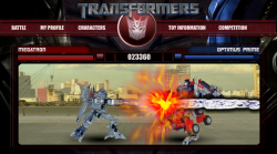
transformersUse cursor keys and C/D to fight in this beat ’em up game. There’s only two characters to try out, but they’re both spectacular and the computer fights back hard!
Learn the special moves for maximum effect, including devestating transforming moves and ranged weapons.

Rise of the Silver Surfer

Tuesday, July 8th, 2008

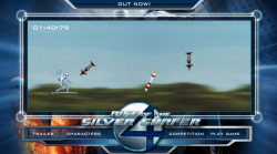
silver-surfer-1Use the mouse to dodge incoming missiles in this fast paced side scrolling action game. How long can you last?
Postmortem:

Behind this basic looking game lies a well tuned piece of gameplay. Anyone can pick this game up in seconds and it feels good to float about on a flying surfboard, but mastery is a tricky task. At it’s heart, there’s just one task – dodge missiles. And only two types of missile too – straight ones and seeking ones. Behind the scenes though there’s a subtle level progression that takes you through some 15 or so different stages of types of attacks. From one at a time, through waves of attacks, to an endless onslaught. You can really get into a rythem of dodging and it feels great when you get into that flow state, diving one way or another almost omnisciently.

The game played awful for a while due to not being able to see/anticipate where the next missile was coming from before it was on top of you. The addition of arrows at the edges that grew as the missiles got closer helped a lot, then the final touch of a launch sound that subtly prompts the player to look out for a new arrow finalised the gameplay feel.

The motion of the Surfer himself mattered a lot too. He needs to be flingable, but also controllable. To move fast when needed, but also to have precise control when required. This is achieved with a fairly complex system of accelerating towards the mouse faster the further away he is, and progressively more damping the closer to the mouse he gets so he doesn’t overshoot and oscillate wildly.

The game looks like a sideways scroller, whizzing over trees at a tremendous rate. The background scroll is a simple looping tween however, and all the gameplay is static on top. Even when I tell myself this whilst playing, it’s a powerful enough illusion to give me a real sense of speed.

One of the few issues I have with the game is that it only becomes really fun for the player when they are challenged to their skill level. When you’re learning to play, the game ramps up appropriately, but when you’ve played a few times already, you have to wade through the early easy levels to get to the fun bits. There wasn’t much scope for changing this in the project, but if I were to revisit this game I’d think up something to let you play on from where you were before.

Lessons:

  • Simple games can be great fun if they feel just right
  • Shortcuts can often work where a ‘proper’ solution would take longer and give very little tangible benifit

Little Chef

Wednesday, July 2nd, 2008

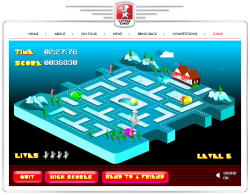
little-chefDodge the meanies and collect all the dots in this isometric Pacman-style game. It’s not massively original, but the graphics and sound are lovely, and it plays great too. Collect the ingredients for a big breakfast amongst the 10 uniquely psychadellic levels to get the chance to take out the baddie trucks. Combos earn you bigger points if you can manage them without getting caught.
 

Tide Dawn Stainscrubbers

Sunday, May 25th, 2008

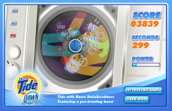
tide-dawn-stainscrubbersUse your mouse to control the main bubble and erase stains in this washing machine clean ’em up. Grab the bonusses for a powerful boost in cleaning power.


Postmortem:

The original concept for this game started out as a fun sounding idea. You were a bubble, inside a washing machine. You’d naturally cling to the edges, but could leap out into the spinning drum where you’d clean anything you passed over in your jump. The jump would be affected by the tides, centrifugal force and so on.

After prototyping this, the client didn’t like it. It wasn’t a bad game, but it was pretty hard to pick up at first. We offered to make it easier (it was just a prototype after all), but they instead wanted a completely different gameplay mechanic. Their suggestion was close to what you now see.

I built the new mechanic, and discovered it was dull! Boredom isn’t a good basis for a game, so I set it up to be pretty short on the theory that players might stand a chance of getting to the end. Also, the game has few special tricks (basically, slow mode, fast mode and bonus mode), so I spread these densely across three levels so that the player would constantly have something new happening, if only for a short period of time. It wasn’t an awful game at this point, but wasn’t great either. Most people who playtested it at least got to the end which was the point, as that’s where the datacapture and competition elements came into it at that time.

The client liked this version more, but wanted the experience to last longer. Much longer. At their request, we extended the game to ten levels each as long as the previous, with a chance to drop out at any point if you failed to clean the super-stain or collect one of the boost bonusses. Now, not even the in-house quality testers would play to the end. For a couple of levels it was interesting, but after that it was just repetitive and dull.

The client liked this version lots, and that’s what you see today!

Lessons:

  • Sometimes, a client’s demands will simply wreck your project! You can try to direct them towards a better solution, but you need to be prepared to back down and let them break it if that’s what they really want
  • Don’t get too attached to your creation if you have any form of external client to answer to!
  • Repeated itteration doesn’t always lead to a better game
  • It’s not advisable to stick too closely to the product’s concept in an advergame. Often it’s better to make a good game, and find a way to shoehorn the product into it rather than the other way round.
  • Games MUST be fun!

ClickRace

Thursday, May 15th, 2008

clickraceA silly little game to test how fast you can click a button 50 times. It’s not quite as easy as it looks though…

Play ClickRace on this site

I wrote this game as an experiment in advertising. It is deliberately a simple game, but with a few silly tricks that give it some lasting appeal so it’d distribute well. Then, I put a version on my site with google ads, a version out on the web with mochi ads built in and a version on Kongregate with their ad-share system in place.

So how has each version done? Well, I wouldn’t call them resounding successes:

Google ads: $1.96 from 40 impressions

Mochi ads: $15.92 from 113046 impressions

Kong ads: $2.31 from 2452 impressions

All of the above are over a period of a fair few months. So, number one problem: Not enough impressions! Number two problem: Mochiads pays bugger all! A hundred thousand impressions isn’t a lot, granted, but then neither is $16. Scale that up by a factor of 10 for a million-plays game (which is about right for a fair game with fair distribution), and you get $160. Which is pathetic.

Google ads looks rather better, but remember that the ads don’t travel with the game, but stay on your own website. That means you only get paid if people are actually on your site itself, not if the game is played on a portal elsewhere, which is the norm.

Get rich quick via advertising? Doesn’t seem likely from these figures.

Zotti-Motti

Tuesday, May 13th, 2008

zotti-motti-roomZotti-Motti is the mascot for the Austrian Stadhalle building. I created multiple elements for the website.

Postmortem:

Main room: The hub from where you can navigate to the rest of the site. Click the TV console screen for the platform game, the cards on the bed for the pairs game, the radio for the karaoke and other elements for more stuff like galleries and stories (not generally built by me). Don’t miss stroking Zotti-Motti’s fur with the mouse, and playing with all his dangling toys too. My AS2 physics engine works hard here to create these effects. There are a number of other easter eggs in this room for the observent and inquisitive to find.

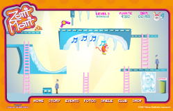
zotti-motti-gamePlatform game: Use cursor keys to guide Zotti-Motti through this platform-puzzle game. There are only six levels, but each one is carefully crafted to have unique puzzles and items to solve. The idea was to make the player think around the cartoon physics of the game and use the objects they find to help progress.

I’m really pleased with the way the puzzles in this game turned out. Every level presents something you haven’t seen before, which forces you to keep thinking throughout the game, but doesn’t force a steep difficulty curve on you. A lot of games just get harder, faster and require more skill as you progress. This one forces you to rethink each level, but once you have worked out the solution you should be able to achieve it fairly easily.

I’m also pleased with the way the hint system worked out. If Zotti-Motti gets to an area where he needs an object, he either has it and uses it automatically, or he hasn’t got it and a thought-bubble appears with him pictorially imagining it. For example, he thinks about the ice-skates at the top of the ramp in the picture. If you go on the slope without them, he falls over, doesn’t make the jump and laughs at himself. If you do have the skates, he leaps across and taps the icicles playing a randomly picked tune. The tune opens the door at the top, but the door shuts too fast for you to get there. The idea is that you have to remember the tune then re-play it on the icicles near the door in order to open it (this is as hard as the puzzles get in this game). I tried to think up unusual and imaginative puzzles like that as often as possible, and largely succeeded I think. Each one gives the player a little rewarding pat on the back as it is solved, which helps keep their interest up and makes them feel clever and special for having worked it out. This goes back to my core principle that games should be fun, not difficult. It’s fun to solve puzzles, but it isn’t fun to be beaten up by them. It’s fun to slide down ramps and jump ravines, but it’s not fun if it requires an immense amount of skill to perform.

The platform engine technically took an unusual path in this game. Zotti is a series of square movieclips underneath, as are all the things that can be walked into or stood on. Each square is tested for collisions with Flash’s AABB collision test system; MovieClip.hitTest(clip), which is wonderfully fast compared to testing points against shapes. This also means we can have very free-form levels that aren’t constrained to a grid, and positions can be tuned to the nearest pixel without extra work. Bounding boxes are also pretty big compared to points, and tunnelling through objects becomes a much smaller issue with this technique. All this makes for a considerably more robust platforming experience, even when Zotti-Motti is moving fast with the high-jump ability, or the rollerskates. Robustness is essential in platformers! As soon as the player glitches through a platform, or gets killed by a static wall etc, they’re going to go right off your game.

Baddies in this game are very simple timeline tweens back and fourth over the same area. Their motion is detected and they are set to their idle or walk cycle animations as appropriate.  This works really well as the baddies don’t ever have to react to the player or deviate from their path. It lets you design their actions right there in the Flash IDE where you can see them in place right away.

That’s another principle I developed more on this game. Level design in the Flash IDE. Before, I’ve often had arrays of data that levels are created from, with assets in the library and so on. This works, but is hard work as a development cycle as it is an inherrently non-visual process. It’s led to a few games having too few levels to do them justice too, which is a shame. Far better is to build interractive clips that you can position directly on stage to build up the levels, with all the magic associated with them at runtime automatically. That way, the Flash IDE itself becomes your level design tool, and you get all the power of the editing and animation tools to play with as you go, hopefully leading to better looking and better playing level design.

Lessons:

  • Try to introduce new concepts for the player to tackle each level, rather than just ramping up the difficulty level
  • Building level design tools directly into the Flash IDE is a great idea
  • AABB collisions are a great tool in the right circumstances
  • Everyone loves a cute pink fluffy monster

zotti-motti-pairsPairs game: Nothing too special here. Just the traditional matching pairs game that appears everywhere on the web. This version was based on the Sonic Rush Adventure game I built previously, so you can turn cards over as fast as you like and it keeps track nicely. You also get a little bit of sound when you match a couple of instruments too. It’s a nice little game, but won’t hold your attention for long.
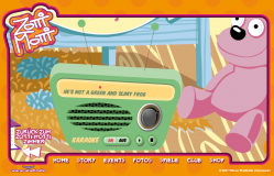
zotti-motti-karaokeKaraoke: The client wanted the Zotti-Motti song to be played on the radio in the room. Easy enough of course. Then they wanted the lyrics to display in time with the music – a little harder. Then they wanted a bouncing ball to run along with the words and syllables, all in perfect time too. Now we’re into the realm of a technical challenge!
I started this the old fashioned hard way, with a sound editor. I added markers manually at each syllable by playing and pausing the sound, and transcribed them into the code to be used as times. It was a horribly slow, error-prone and dull process, and the results were rubbish anyway. I gave up a couple of lines into the song.

The solution was to build a tiny app that played the song and listened for mouse presses. Each time the mouse was pressed, Flash got the millisecond position from the sound object and traced it in the output window. Then, all I had to do was listen along with the song and click along in time with the words – something the human brain is a lot better at than treating each word separately in a sound editor. The times were copied into the code’s data and the results were horrible.

Turns out I don’t have any rhythm.

Luckily, one of the other coders in the office was a musician, and tapped out the timings considerably better, the results of which you can see in the song. If you can stand to listen to the cheesy horror!

Actually, I rather like the girl’s voice in the song. Shame about the male voice. And the song itself!

Lessons:

  • If it feels like you’re doing it the hard way, you are. Rethink your approach
  • Building a very quick rough tool is often faster than tackling the job with the wrong tools (incidentily, this goes for car maintenence and DIY too)

Warner Bros TV Listings

Monday, May 12th, 2008

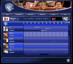
wbtvI created this TV listings Flash application to go on the new Warner Bros TV on demand site. You can zoom in and out to see what shows are scheduled to start and end over the next few weeks.

View the Warner Bros TV Listings

Chronicles of Narnia: Reepicheep Run

Monday, May 12th, 2008

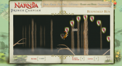
reepicheep-run-gameUse the mouse to control Reepicheep the heroic mouse in this tricky skill game. Click somewhere above Reepicheep to make him leap towards the mouse. In the air, move the mouse in-front or behind him to apply aftertouch to your jump’s path.
Collect powerups to jump further, have more control in the air and gain extra lives.

Postmortem:

This game is one I rather like personally. It’s got on of my favorite things in a computer game – a tactile main character. By that I mean you have a certain subtlty and finesse in the character’s control that rewards patient learning and practice.

Unfortunately, these things are exactly what web-game players typically don’t want to do. They want to leap straight in and be acceptably good at the game, not to fall off every branch with no idea what they’re doing wrong.  If a random web player can’t get into the game straight away, they’ll almost certainly go elsewhere. There’s no shortage of other games out there to play.

A second issue caused trouble with this game too. Compounding the fact that it’s a pretty tough game was the fact that the client kept wanting more difficulty added to it. First it was extended to be considerably longer (which wasn’t a bad thing). Next they wanted to speed the auto-scroll up as time went by (which makes it become very high pressure towards the end). Then they wanted fewer lives and fewer life power-ups (I was generous with them as it’s so easy to die). Then they asked us to add branches that break if you sit on them too long (adding even more pressure and no chance for a breather). Eventually they wanted arrows shooting through the branches at random, which we made a stand against since you have very little chance to avoid them. It’s a game about planning your next move, rather than reacting. Once you’re in the air, you can only make fairly small adjustments. In no way could you dodge fast moving arrows!

Finally, when we discovered that lots of people couldn’t get the hang of jumping, we asked the client if we could build a jump preview line that showed the rough path of the jump before you clicked. They were heavily against this idea, dispite my thinking it would help considerably with getting new players to a competent standard rapidly.

Dispite the added difficulty, I still like this game and still enjoy playing it, which is unusual for games I’ve worked closely on. Usually you play a game to death during its development, and are happy not to see it again afterwards. Not so with this one. I still come back to it from time to time to see if I can still perfect those jumps.

The character’s movement comprises a few subtle elements. Firstly, the mouse takes his initial jump direction from the angle to the cursor. His jump force is calculated from the distance, so you can do small adjusting hops, nimble jumps to a nearby branch, or huge leaps across the screen. Then, the spring motion of the branch is added onto that initial force, so you can time your jump with the release of the energy in the branch to go higher or further, or the opposite – and do a minimal jump. You can leap up through branches then land on them, or leap down through branches to a lower level and add energy to your next jump. In mid-air, there’s an affect of aftertouch where Reepicheep has a slight acceleration towards the mouse cursor, so you can bend and curve his jump after you’ve taken off. You can power up all these abilities too, with the pickups strewn around. Finally, if you get to the right hand edge of the screen you can push-scroll the level, so it’s even possible to speedrun the game!

Collision detection was an issue in build. Branches are necessarily thin things, and the character moves necessarily fast! Tunneling through branches is simply unacceptable in this case as you’re depending on hitting them for survival throughout the game. The solution was to scan every pixel between Reepicheep’s previous position and his next, and test each for collision with the branches so that you collide with even the thinnest hint of a branch. To keep everything running well, the forrest is divided into lots of short segments, each is attached to the stage just before it is needed, scrolled through view then removed as it goes out of sight. Only branches in the current segment are tested for collisions of course. New segments are attached automatically when required, and each segment contains power ups right there on the timeline as required. A discovery algorithm runs searches through instance names at runtime as segments are attached, learning what items exist and setting them up as appropriate. This works really well, and far better than having metadata in the code that has to be kept in sync with what’s on stage, or worse, coordinates for powerups stored in the code. It’s just so much easier to adjust – you just chuck a new powerup on stage from the library, and give it an appropriate instance name. Recompile and it’s there in the game, functioning.

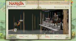
reepicheep-run-endThe final part of the forrest contains a large treehouse that you make one final heroic leap to, then squeak your important message to Prince Caspian directly. Granted, not many people are going to get this far as it’s a pretty tough game, but those that do should at least feel like there’s a proper conclusion, a bit of a point to it all. As a game developer it’s easy to overlook how important this is as it really adds nothing to the gameplay mechanic at all. It’s just a big bitmap and some special case coding at the end, rather than a different challenge etc. It’s hard to justify why we’d want to build it, but the feeling of closure and reward for the player is immesurably important.

Lessons:

  • Tricky yet rich control mechanisms aren’t generally a good idea. Extensive user training is required, which most people won’t bother to work through
  • A proper end goal is a great way to finish a game. Just cutting at a given point really isn’t! This one does it well, with the final treehouse with Prince Caspian being a really solid final point
  • The Flash IDE is still a great level design tool

Speed Racer Chaser

Friday, April 25th, 2008

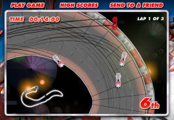
speedracerUse cursor keys to drive in this high-speed racing game. Hit spacebar to deploy your car’s weapon, and shift to launch into the air. Can you beat all the other players, which are recordings of other real human drivers?

Postmortem:

Ah, a chance to do a pure arcade racing game, with actual racing cars rather than trollies or reindeer or airport baggage karts! Brilliant. I was determined to make a really good Flash racing game, with arcade but partially realistic handling, fun tracks, weapons and a little bit of a multiplayer twist.

AI in racing games is hard. Even the big name consold games don’t get it right, and have either unrealistically good AI drivers or comically bad ones. In a lot of games, the computer AI just bulldozes through your car sticking to its pre-programmed lines like a limpet. It feels unfair, and it’s not good enough! Rather than build a crappy AI for this game, I came up with the idea of recording people’s gameplay whilst they were racing and storing them on the server (stored by their starting position and overall performance). Then, when a new game is started, the server puts you in a random grid position and sends out 8 replays – one from each remaining grid slot. They are picked at random, but in a skewed way so that you play against a mix of the best, worst and mediocre players out there. That’s self-ballancing – the range of opponents you meet is determined by the actual range of skills out there, from good to bad. There is a par time over which your score isn’t recorded to avoid skewing the results towards people who just leave the game running forever, but other than that it’s a level playing field. This strategy really worked for this game, and everyone gets opponents who play roughly at their level – and some who are faster that they can work towards beating.

The big problem with storing and serving replays is that there’s a lot of data. AS2 doesn’t handle binary data very well except in pre-given formats that are delt with internally like jpegs, sounds or SWFs. So, a replay consists of a great long string of car coordinates etc in a text format. There’s very little encoding, as I found that simply processing the raw strings was enough of a task for Flash, let alone processing an encoding on top of that. I’d have liked to have compressed the strings, or base-64 encoded them or similar, but it just wasn’t feasable. The remaining problem was that each play of the game required about a 1mb download of replay data from the server, which was very bad for bandwidth when the number of plays started to climb dramatically. We had to trim back the number of replays sent to the client to just 4, then 2, then none as the load increased. The URL presented here allows you to have all 8 opponents switched on, as it’s going to be pretty low-load from this website.

Car handling was a major area of improvement in this game over previous racers I’ve built. The cars have a single giant virtual tyre that they run on, which resists sideways motion and promotes forwards motion. When the car turns, this virtual tyre turns with it, causing the car to grip and change direction. This is reasonably analogous to the way a real car turns in many ways, and leads to a decent feel. Rather than programming in effects like sliding if you turn too fast, or if you land a jump facing sideways to the direction of travel, it just naturally falls out of the physics model. Likewise, slow speed turning works better this way too. The model is also very tunable to different car styles, so some are fast but have little grip, some have too much grip and are hard to control, some are ballanced and so on. There is no ‘best’ car, although there tends to be a couple per track that people end up using predominantly over the others.

A big part of the Speed Racer film was the twisting looping jumping corkscrewing tracks. In a 2D game you’re limited to how far you can recreate these effects, but the tracks certainly do have these stunts in them, which is a nice effect. Even better, you can short-cut them in cunning ways using your car’s jump ability, which adds a little depth.

Another requirement from the film is the use of car-to-car weapons. This poses a problem with the replay technology, as a replay is by its nature an asynchronous event. It does not contain data saying how the human player reacted to being hit by a weapon at any random point. The simple rules I adopted were to never fire weapons at the human player (ie, weapon usage is not recorded in the replays), and if a replay car gets hit, to simply spin it around in a straight line along its direction of travel until it falls off the track edge.

The other thing you can’t do with a replay is car-to-car collisions. You can’t purturb the replay car from its course, as that would put you ‘off’ the replay line with no obvious way to get back on it. You can’t just slow or collide the human player either, since that would get recorded in their replay and when played back to another player, would look strange as they randomly react to a collision that didn’t happen. There was nothing better I could think of than simply allowing cars to overlap. Not completely satisfying, but that’s all I could do.

As cheating features quite heavily in the film races, I’ve deliberately allowed for it in the game. If you use your car’s jump facility carefully, there are a number of places you can take shortcuts by jumping sections of track. It’s risky of course – you stand a fair chance of falling off the track instead of saving time, but that’s good for ballance.

There’s an issue with the pace of the game and some of the cars. If the player picks one of the faster cars, it’s hard to see what’s coming and to keep the car on the track whilst cornering. Falling off track is punishing to your time at least, but doesn’t throw you out of the race because it’s really rather easy to do. If you opt for a slower, more controllable car, you stand less chance of keeping up overall.

Performance is vital in a game like this. Keeping the framerate high was always a priority, right from the beginning. There’s a huge amount of stuff bitmap-cached to aid this. The background is a short loop, scrolled around as required and flipped to the other side of the loop when needed. There are a few layers of it, but each is just a series of bitmap cached effects. The track itself is created from segments at the start of the game. The track exists as metadata in the code, as a simple array of segment IDs. The IDs are itterated as the track is created at the start, and each segment is instantiated into its own movieclip from an end-marker clip in the previous segment, then bitmap-cached. This allows for much bigger tracks, as it neatly gets round the 2880px bitmap limits by having lots of smaller ones instead. It does take a while to produce the track at the start though. This is what’s happening behind the silver “creating track” screen before the race. Without the bitmap caching, the length of time that screen appears for (several seconds on most machines) would happen to be the in-game framerate too!

Generating the track in segments gives me a nice convenient way to tell how far through the track each car is. They are hit-tested against the segment they are in and the next one too, and their position is updated when they are in the ‘next’ segment. If they are over no piece of track, their position is hit-tested against all segments as they may be about to perform a shortcut jump. Whilst in the air however, they are considered to be on the piece of track they last touched. That’s where they get reset to if they crash, and where they are positioned in terms of the race order.

Lessons:

  • Multiply up the bandwidth for a typical gameplay by a best-case number of plays to see if it’ll work with your hosting provision!
  • Add subtle touches for more depth
  • Processing big strings in Flash is horribly inefficient
  • When used right, bitmap caching saves huge amounts of CPU time