Posts Tagged ‘hyperlaunch’
Always: Leila
Wednesday, December 3rd, 2008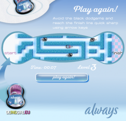 If the idea of playing a game on an Always sanitary towel disgusts you, just imagine how I felt developing this one!
Dispite the dubious concept, this little maze game is reasonably fun. Use cursor keys to race across the maze as fast as you can, avoiding the enemy cars.
Star Wars: Clones V Droids
Wednesday, November 26th, 2008 You have just 30 seconds to anticipate your opponent’s thoughts, give your troops orders and move them into position in this multiplayer ballistic fighting game. Then everyone opens fire, and another turn starts.
UPDATE! On playing this recently it seems to have been updated by someone, and broken in the process. The game now crashes often when you’re walking around, which never used to happen. What a shame.
Postmortem:
I could hardly believe it! Not only were we doing a game for the giant Star Wars Clone Wars franchise, but we’d pursuaded them to try something risky and unusual too! A custom-made ultra-light PHP back end would join random players together in an almost anonymous way over the internet so that they could battle each other rather than some shonky AI.
Not only that, but it worked too! In a little over a week, I’d built the game engine and back end and proven the concept. Then the public was unleashed on it. The server coped admirably with the strain of thousands of people playing it over and over. Success!
It could have been better, of course. Just about all things can be improved. In this game, I’d have liked to have spent a little longer getting a few of the interface details working smoother. It’s fiddly to set up shots, which is an area that could do with as little interface-friction as possible. That aside though, I’d really like to have improved the multiplayer features.
I designed the game to put a game together for every two visitors to the site. You get paired off with the next random that comes along, and you’re playing. Minimum fuss, minimum barrier to entry. My experience with lots of multiplayer games is that you get to a daunting room full of 11yo kids who are just waiting for a newbie to kick about the place. I specifically designed against that effect here by removing the ability to pick your opponent, or play them again, or even to know who they are. All you get is a rank – a single number to hint at whether they’ve played before, and whether they were any good or not.
This really works – people dive in and play in generally fair games, which is great. It also means we never have to store user accounts on the server, which is also great. Each player keeps their rank in their shared-object, and it is exchanged at the start of the game. At the end of the game, each player calculates their new rank based on the Elo chess ranking system, and stores it away for next time. Yeah, you could fiddle the number and cheat, but really, who cares? There’s no leaderboard, and no way to shout out how great you are, so there’s very little incentive to cheat. That’s the best cheat-protection system I’ve ever come across!
The downside is that whilst it’s addictive for a while, it won’t hold people for a great length of time. After a while you get bored of there being no further progression. Of not being able to chat with your opponent and of not being able to have a rematch if it was a great game. These features I’d add in another similar game.
I’d give the players a chat box, that they could use at any point especially including whilst waiting for the server to sync up and exchange the moves. I’d also add a ‘play this person again’ checkbox that appears mid-game, so if you both clicked it and left it selected, it’d arrange your next match against each other. I’d also consider an optional match-up room of some sort, so you could meet up with friends. I’d definitely let you enter a name for yourself and exchange that with the other player, so you had some idea who you were playing. Maybe allow a pictorial avatar too. And some sort of earned rankings beyond a simple number. Maybe a veteran’s medal after 10 games, a high-roller medal after they hit a rank of 1600 and so on. You could even allow different things in-game based on what they had earned. Maybe veterans get the ability to pick their fights more carefully. Perhaps high ranked people get access to new weapons when playing against other high ranked people. Giving the player some sort of progression, something to work towards, would go a long way.
Lessons:
- Multiplayer immediately adds depth to almost any game
- People love playing against people, even if they’re unidentified randoms
- Provide a way for people to communicate in-game
- Provide a way for people to arrange battles with people they know, if they want
- Provide a way for people to give themselves an identity of sorts in your game
- Provide some sort of progression for the player to work towards, over multiple games
- Removing incentives to cheat is far more effective than building technological safeguards against cheating
Charlie and Lola – Hooley Hooping
Friday, October 10th, 2008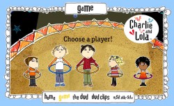 Pick your favourite character from Charlie and Lola and help them Hooley Hoop their way through this simple kids game. Tap left and right in time with the hoop to keep it spinning.
Apache
Friday, August 22nd, 2008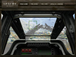 Use keys and mouse in this two-level Apache Gunship game. Do you have what it takes to take orders accurately and take on the role of gunner?
The first mission is a little slow going, but the second mission is worth getting to for the machine gun and rocket action.
Narrated in-game by the actual Apache Gunship pilot who wrote the book, this game is authentic in every detail possible. You can’t get closer to the experience of the real thing online!
Skulduggery Quest
Friday, August 22nd, 2008
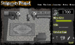 Register to play the quest, then use cursor keys to walk around and the mouse in mini-games.
Postmortem:
The game consists of four main chunks, tied together into a quest:
Hub: Walk around in a vaguely Zelda-like fashion, exploring and picking stuff up. This is intended as a sort of story-led role-playing-game section that takes you through the other mini games.
Spot the difference: Just the basic spot the difference game transferred to a computer. You get a different puzzle made up each time so it doesn’t become completely trivial to solve if you replay.
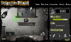 Magic Levitation: A physicsy lift ’em up. Not sure I’ve played anything quite like it before – you have a magical levitation ability that you have to train up until you can chuck the item you need out of the window.
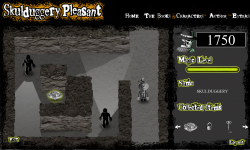 Cave Exploration: A bit like the old Amiga game Commandos. You have to find the final important game item whilst evading the sight of the guards.
Individually, each mini game is amusing for a bit. The big problem with the game as a whole however is the lack of cohesion. I think this stemmed from a lack of adequate planning in the early stages, leading to a fair bit of making-it-up-as-we-go as the deadline encroached. What we ended up with was a nice enough game engine for an RPG, but with no strong story or other characters to interact with. For a story driven game, having no story sounds like a bit of a deal breaker to me. And if there were a story, having no characters also sounds like a problem!
There’s some neat code running under some of this, despite the lackadaisical gameplay experience.
Hub: Whilst walking around, you can pass both in front and behind most objects. I came up with a method to do this that doesn’t require constantly swapping the depths of everything. There are two copies of the clip that contains all the scenery objects positioned directly at the same spot on screen, with your character sandwiched between them. Each item’s position on screen is compared to the characters. If it is above the character then the back version is set to visible and the front invisible. If below, the other way round. Flash’s _visible property works internally by simply skipping the object when rendering to screen, so its very efficient this way.
I wouldn’t recommend you build a similar system however! There’s a downside (isn’t there always). Whilst it works really fast and reliably with one moving object, if you add any more you can’t guarantee that its possible to sort things still!
Levitation: I’ve been developing a lightweight springs and masses engine for a while now. It was last in use on the Rant game, and before that to do a string effect on Paul Steel’s site. Each iteration the springs get more stable, the masses collide more realistically and the efficiency of the engine improves.
The physics engine grew a couple of features for this game. Attractor and repulsor masses for a start (to do the actual levitation bit). The game worked beautifully with an attractor mass – it was like trying to pick things up with a weak magnetic ball. It wasn’t all that easy to play however so I made it a repulsor following the mouse position instead, and got a lovely floaty feel.
The collision engine got an overhaul too. It now has a concept of collision sets. This is a way of tagging a mass such that it knows not to check for certain types of collision that can’t happen, or even that we don’t want to compute to help the game effects. There’s another major performance enhancement gained from sorting all the masses along the x-axis. The sort routine is built into Flash’s runtime engine and hence almost free in terms of execution time. Most of the Flash built in stuff runs really well, but as soon as you try and do something complex and algorithmic in ActionScript (version 2 and below that is) the inherent sloth of the language’s dynamic style means everything grinds to a halt. Anyhow, after the x-axis sorting, masses are only compared until one is found on an x-position that cannot collide no matter what. This runs in both directions from the mass in question and the search is culled beyond the discovered limits. This gives an impressive performance boost overall, at the expense of a small amount of fidgetyness of masses as they settle (if they sort into a different order after a small movement, they get itterated in a different order for collision responses, which can give a different outcome response).
I’ve made pretty heavy use of Flash 8’s new-ish bitmap processing for graphical effects. Push the light around with your magic, and watch the shadows. Its a subtle effect but the shadows move around depending where the light is coming from. Shadows get longer, fainter and adjust their position all in realtime. This is all done using the new drop-shadow filter on each of the graphical objects in the scene, and a bit of trivial trigonometry. A simple effect, but powerful, and I haven’t seen anyone else doing it yet.
The graphical effect of the magic itself is scripted too, rather than an animation. Particles of magic are placed onto a bitmap each frame, then the bitmap is faded and colour transformed via yet more filter effects. Over multiple frames, moving things leave trails across the screen. Pretty.
Caves: The base engine for the caves section is identical to the hub. I can hear what you’re thinking (if you’re still awake). You’re asking how it can have NPCs wondering around when the system can only cope with depth sorting against one moving object. You weren’t asking that? Well you’re getting the answer anyway.
The NPCs follow a set path. They are at a set depth with respect to the walls etc, and are duplicated in the same way (in fact, they’re just objects in the world like any other). If you pick their path and depth in the scene carefully, you can engineer it so that they don’t look wrong. It just means you can’t have an NPC wander about freely as they can’t walk both behind and in front of an object without causing odd glitches. On the final screen the baddies do laps of an island-wall, which seems to break the engine’s rules again. The trick is that the baddies don’t actually go behind the wall at the top – they just stay above it a little. Look carefully and you might see their shadows glint above the wall rather than behind it.
Visual line of sight ‘vision cones’ were a challenge too. It isn’t all that hard check if a particular point on screen is in sight of another particular point. You just cast a ray between them and see if you hit anything that blocks sight along the way. Or if you have the walls in vector form you can check for collisions mathematically with a line intersection check.
To show a cone of vision however, you have to run the above check for every pixel that might be in sight. That’s generally a hulluvalotta pixels, and infeasible for realtime Flash games.
I’m fairly proud of the technique I invented to get sufficient performance here. I first cast a shadow off the back of each of the wall segments to the edge of the screen. This is done by simply projecting the end points of each segment out plenty of distance and joining the dots. This polygon is then drawn to a memory bitmap with the drawing API and clipped to the visible area. Flash is superb at doing this sort of manipulation as long as the shapes are simple, so there’s only a minimal performance cost here.
Once the shadow of every wall is drawn (as if the enemy in question is a light source), we have a set of pixels that the baddie cannot see. A little bitmap magic to invert this, and we have a mask we can apply to its vision cone drawn complete. Job done – our baddie can’t see through walls anymore.
One nice bonus with this technique is that we get almost free line of sight tests between the baddie and any point on screen. First do a hitTest against the complete vision cone shape. If the test succeeds, do a pixel colour lookup on the mask bitmap at the appropriate point. If that point is within a shadow, we’re out of sight. If not, we’re visible. HitTest and getPixel32 are both lightening fast.
This technique has a few unavoidable downsides. Firstly it uses two large bitmaps for every baddie. This means lots of memory allocation (bad for old machines) and lots of pixel setting (bad for any machine in Flash). Its setting all these pixels every frame that costs most of the time in this routine, even though those pixels aren’t used directly on screen. There is also some kind of bug in the Flash player that leads to rapid memory leakage. Switch screens and you lose a meg or two of memory as the new baddies are generated. You also lose a smaller amount each frame. I eventually traced the leakage to a line that reads;
clip.cacheAsBitmap = true;
Without the line, no memory goes missing. With the line, megs per screen. Doesn’t seem to matter if you turn the caching off later, you still lose the memory. This is something that the Flash player is meant to entirely manage internally, rather than it being the programmer’s responsibility. The same behavior exists on the Mac player too, curiously.
Final lesson learned: On the PC Flash player, Key.isDown(1) is a fine way to read if the left mouse is pressed. Its a fine way to find out nothing at all on the Mac. That’s the first really significant difference I’ve found cross-platform with Flash. A testament to just how well the player is built and tested!
Nuts TV: Supreme Fighter
Friday, July 18th, 2008 Combine the best stats of all the fighters on Nuts TV into one super-character, then use him to beat all comers in this Top-Trumps style game.
Track and Field: Fingy and Thumby’s Gym
Tuesday, July 8th, 2008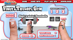 Uh oh, it’s a button-basher. The default idea when no other game concept springs readily to mind.
This one is a little more cerebral than most button bashers though. You have to hit the buttons, then relax back to repeat the exercises at hand. Plus, the characters are pretty amusingly a finger and a thumb. The premise being you have to train up your fingers before attempting to play the game on the DS.
Transformers Beat ’em Up
Tuesday, July 8th, 2008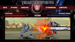 Use cursor keys and C/D to fight in this beat ’em up game. There’s only two characters to try out, but they’re both spectacular and the computer fights back hard!
Learn the special moves for maximum effect, including devestating transforming moves and ranged weapons.
Rise of the Silver Surfer
Tuesday, July 8th, 2008 Use the mouse to dodge incoming missiles in this fast paced side scrolling action game. How long can you last?
Postmortem:
Behind this basic looking game lies a well tuned piece of gameplay. Anyone can pick this game up in seconds and it feels good to float about on a flying surfboard, but mastery is a tricky task. At it’s heart, there’s just one task – dodge missiles. And only two types of missile too – straight ones and seeking ones. Behind the scenes though there’s a subtle level progression that takes you through some 15 or so different stages of types of attacks. From one at a time, through waves of attacks, to an endless onslaught. You can really get into a rythem of dodging and it feels great when you get into that flow state, diving one way or another almost omnisciently.
The game played awful for a while due to not being able to see/anticipate where the next missile was coming from before it was on top of you. The addition of arrows at the edges that grew as the missiles got closer helped a lot, then the final touch of a launch sound that subtly prompts the player to look out for a new arrow finalised the gameplay feel.
The motion of the Surfer himself mattered a lot too. He needs to be flingable, but also controllable. To move fast when needed, but also to have precise control when required. This is achieved with a fairly complex system of accelerating towards the mouse faster the further away he is, and progressively more damping the closer to the mouse he gets so he doesn’t overshoot and oscillate wildly.
The game looks like a sideways scroller, whizzing over trees at a tremendous rate. The background scroll is a simple looping tween however, and all the gameplay is static on top. Even when I tell myself this whilst playing, it’s a powerful enough illusion to give me a real sense of speed.
One of the few issues I have with the game is that it only becomes really fun for the player when they are challenged to their skill level. When you’re learning to play, the game ramps up appropriately, but when you’ve played a few times already, you have to wade through the early easy levels to get to the fun bits. There wasn’t much scope for changing this in the project, but if I were to revisit this game I’d think up something to let you play on from where you were before.
Lessons:
- Simple games can be great fun if they feel just right
- Shortcuts can often work where a ‘proper’ solution would take longer and give very little tangible benifit

 RSS 2.0 full site