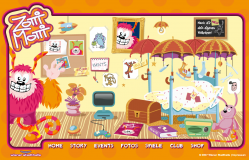
 Zotti-Motti is the mascot for the Austrian Stadhalle building. I created multiple elements for the website.
Postmortem:
Main room: The hub from where you can navigate to the rest of the site. Click the TV console screen for the platform game, the cards on the bed for the pairs game, the radio for the karaoke and other elements for more stuff like galleries and stories (not generally built by me). Don’t miss stroking Zotti-Motti’s fur with the mouse, and playing with all his dangling toys too. My AS2 physics engine works hard here to create these effects. There are a number of other easter eggs in this room for the observent and inquisitive to find.
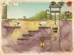
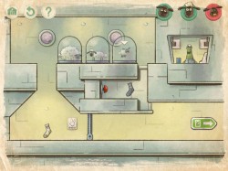
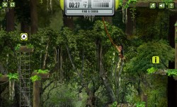
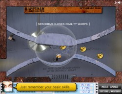
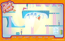 Platform game: Use cursor keys to guide Zotti-Motti through this platform-puzzle game. There are only six levels, but each one is carefully crafted to have unique puzzles and items to solve. The idea was to make the player think around the cartoon physics of the game and use the objects they find to help progress.
I’m really pleased with the way the puzzles in this game turned out. Every level presents something you haven’t seen before, which forces you to keep thinking throughout the game, but doesn’t force a steep difficulty curve on you. A lot of games just get harder, faster and require more skill as you progress. This one forces you to rethink each level, but once you have worked out the solution you should be able to achieve it fairly easily.
I’m also pleased with the way the hint system worked out. If Zotti-Motti gets to an area where he needs an object, he either has it and uses it automatically, or he hasn’t got it and a thought-bubble appears with him pictorially imagining it. For example, he thinks about the ice-skates at the top of the ramp in the picture. If you go on the slope without them, he falls over, doesn’t make the jump and laughs at himself. If you do have the skates, he leaps across and taps the icicles playing a randomly picked tune. The tune opens the door at the top, but the door shuts too fast for you to get there. The idea is that you have to remember the tune then re-play it on the icicles near the door in order to open it (this is as hard as the puzzles get in this game). I tried to think up unusual and imaginative puzzles like that as often as possible, and largely succeeded I think. Each one gives the player a little rewarding pat on the back as it is solved, which helps keep their interest up and makes them feel clever and special for having worked it out. This goes back to my core principle that games should be fun, not difficult. It’s fun to solve puzzles, but it isn’t fun to be beaten up by them. It’s fun to slide down ramps and jump ravines, but it’s not fun if it requires an immense amount of skill to perform.
The platform engine technically took an unusual path in this game. Zotti is a series of square movieclips underneath, as are all the things that can be walked into or stood on. Each square is tested for collisions with Flash’s AABB collision test system; MovieClip.hitTest(clip), which is wonderfully fast compared to testing points against shapes. This also means we can have very free-form levels that aren’t constrained to a grid, and positions can be tuned to the nearest pixel without extra work. Bounding boxes are also pretty big compared to points, and tunnelling through objects becomes a much smaller issue with this technique. All this makes for a considerably more robust platforming experience, even when Zotti-Motti is moving fast with the high-jump ability, or the rollerskates. Robustness is essential in platformers! As soon as the player glitches through a platform, or gets killed by a static wall etc, they’re going to go right off your game.
Baddies in this game are very simple timeline tweens back and fourth over the same area. Their motion is detected and they are set to their idle or walk cycle animations as appropriate. This works really well as the baddies don’t ever have to react to the player or deviate from their path. It lets you design their actions right there in the Flash IDE where you can see them in place right away.
That’s another principle I developed more on this game. Level design in the Flash IDE. Before, I’ve often had arrays of data that levels are created from, with assets in the library and so on. This works, but is hard work as a development cycle as it is an inherrently non-visual process. It’s led to a few games having too few levels to do them justice too, which is a shame. Far better is to build interractive clips that you can position directly on stage to build up the levels, with all the magic associated with them at runtime automatically. That way, the Flash IDE itself becomes your level design tool, and you get all the power of the editing and animation tools to play with as you go, hopefully leading to better looking and better playing level design.
Lessons:
- Try to introduce new concepts for the player to tackle each level, rather than just ramping up the difficulty level
- Building level design tools directly into the Flash IDE is a great idea
- AABB collisions are a great tool in the right circumstances
- Everyone loves a cute pink fluffy monster
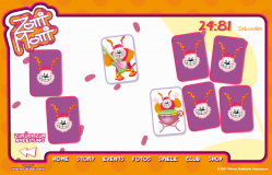 Pairs game: Nothing too special here. Just the traditional matching pairs game that appears everywhere on the web. This version was based on the Sonic Rush Adventure game I built previously, so you can turn cards over as fast as you like and it keeps track nicely. You also get a little bit of sound when you match a couple of instruments too. It’s a nice little game, but won’t hold your attention for long.
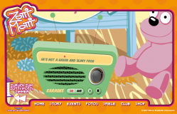 Karaoke: The client wanted the Zotti-Motti song to be played on the radio in the room. Easy enough of course. Then they wanted the lyrics to display in time with the music – a little harder. Then they wanted a bouncing ball to run along with the words and syllables, all in perfect time too. Now we’re into the realm of a technical challenge!
I started this the old fashioned hard way, with a sound editor. I added markers manually at each syllable by playing and pausing the sound, and transcribed them into the code to be used as times. It was a horribly slow, error-prone and dull process, and the results were rubbish anyway. I gave up a couple of lines into the song.
The solution was to build a tiny app that played the song and listened for mouse presses. Each time the mouse was pressed, Flash got the millisecond position from the sound object and traced it in the output window. Then, all I had to do was listen along with the song and click along in time with the words – something the human brain is a lot better at than treating each word separately in a sound editor. The times were copied into the code’s data and the results were horrible.
Turns out I don’t have any rhythm.
Luckily, one of the other coders in the office was a musician, and tapped out the timings considerably better, the results of which you can see in the song. If you can stand to listen to the cheesy horror!
Actually, I rather like the girl’s voice in the song. Shame about the male voice. And the song itself!
Lessons:
- If it feels like you’re doing it the hard way, you are. Rethink your approach
- Building a very quick rough tool is often faster than tackling the job with the wrong tools (incidentily, this goes for car maintenence and DIY too)
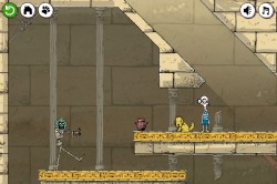
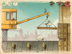
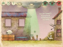
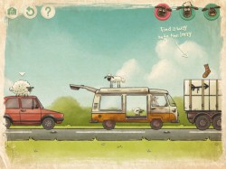
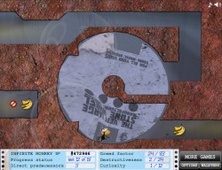
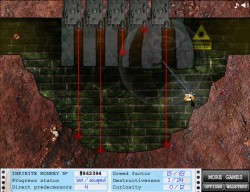
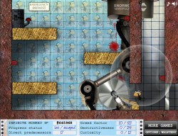

 Platform game: Use cursor keys to guide Zotti-Motti through this platform-puzzle game. There are only six levels, but each one is carefully crafted to have unique puzzles and items to solve. The idea was to make the player think around the cartoon physics of the game and use the objects they find to help progress.
 Pairs game: Nothing too special here. Just the traditional matching pairs game that appears everywhere on the web. This version was based on the Sonic Rush Adventure game I built previously, so you can turn cards over as fast as you like and it keeps track nicely. You also get a little bit of sound when you match a couple of instruments too. It’s a nice little game, but won’t hold your attention for long.
 Karaoke: The client wanted the Zotti-Motti song to be played on the radio in the room. Easy enough of course. Then they wanted the lyrics to display in time with the music – a little harder. Then they wanted a bouncing ball to run along with the words and syllables, all in perfect time too. Now we’re into the realm of a technical challenge!
 RSS 2.0 full site